Images of the Week: Three on a Match

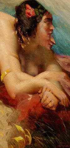
A Goblet Emptied by clifftoppler
As I predicted, the boundaries of what is and what is not fractal art would have to be reshuffled once the Fractalbookers shelled out for Ultra Fractal 5.
I said UF5 could be downgraded to a Photoshop plug-in, and here we see the proof. A digital reproduction of a detail of a painting by William Etty was imported into UF5 and then "filterized." There is nothing fractal about this image, although it appears in Renderosity's fractal gallery under the genre of "mythology." The mods at the art community should immediately move this image to the 2D gallery.
To be honest, I rather like what the artist has done with Etty. But this is a case of image manipulation and not fractal generation.
The artist also makes this observation:
I was experimenting with the image import feature new to UF 5, and suspect it may be calling for some reappraisal of their aims by many fractal artists. Would that be a bad thing? Reappraisal should be the name of the game for all artists. We renew ourselves daily.
I explained in an earlier OT post why UF5 will bring about more than a "reappraisal." It should, in fact, usher in a paradigm shift as to what constitutes fractal art. I'm all for renewing myself daily, but that doesn't mean we can suddenly call a manipulated digital image (an "apple") a fractal (an "orange").
If I was an investor in Ultra Fractal, I would start to worry that images like the one above -- asserting to be "a fractal" and claiming to be made primarily with UF5 (with a bit of face tweaking in Painter)-- could begin to seriously de-value the software. And why? Because Ultra Fractal could quickly be associated with a stream of very un-fractal art -- or, at best, highly diluted fractal art. UF might become to fractal art what Hollywood is to film. Yes, UF streams forth plenty of loosely termed fractal-like "product," but no one is going to confuse it anytime soon with leading the vanguard of the art form.
~/~

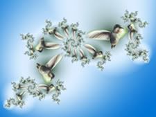
Hummingbird-WIP by Keith MacKay
To be fair, I suppose this image is more of a work-in-progress than a finished art piece. MacKay posted it to his blog, admitted he was playing around with UF5, and merely noted it "has potential." To me, it looks very much like what I used to commonly see when BringItIn was first introduced. You know. Pets and friends inexplicably swept into the pinwheel maelstrom of a spiral.
However, I sense real money-making possibilities here. Just pack up your laptop, with UF5 fully loaded, and park yourself next to the caricaturist in a busy city square. Snap a cell phone photo of a patron, grab an email address, and send each mark a pic of themselves trapped in a black hole of swirly swirliness. Or hang around carnivals, preferably near the Tilt-A-Whirl, and render a few snappy, import-heavy "sketches" of festive riders as you compete with those auto-flash shots of the screaming, green faces riding the roller coaster.
Why include this image among today's reviews? Wasn't MacKay the artist who so painstakingly "mastered his tools" to produce striking UF hummingbirds? Although I admit the image above is eye-catching, there's a certain rushed, click-and-shoot quality about it -- an ambiance not seen in MacKay's earlier work. This looks, well, engineered. Like a fractal version of the Canon Sure Shot.
This also reminds me of the Dilbert joke where a computer programmer is asked to write a program that will do everything he currently does. When the programmer finishes the task, the program immediately replaces him, and he's fired.
~/~


I've complained in previous posts that I sometimes find work made with Ultra Fractal to have a kind of cloned, homogenized trait. I speculated this sensation is probably due to the way UF images are made. Someone writes a base formula -- and then other UF users step on it producing a string of ad infinitum variations on a theme.
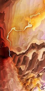
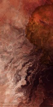
A casual chain of this phenomenon can be seen in the images above. One is from an admitted relative newcomer to fractal art who notes in a blog post in February 2008 that she'll be taking a UF course from the Mississippi School of Anti-Fractal Art™. The other is from the Benoit Mandelbrot Fractal Art Contest director cum soon-to-be-exhibited "judge" and one of the blurbed "most important fractal artists in the world."
See what I'm driving at when I gripe about everything mashing together to look similar? There's a certain uniformity of style here -- in line, texture, movement, even in perspective. The only real difference is found in the use of color. In that regard, I much prefer the warm (no pun intended), vibrant tones of Kerrigan's image. As its title suggests, there's a sense of urgency conveyed and a suggestion revealed about the destructive potential of the flames. Jones' image just reminds me of something itchy -- like chafing or a nasty rash. The only urgency I feel is an impulse to smear Lanacane over the surface of my monitor screen.
Tags: fractal, fractals, fractal art, fractal blog, art criticism, three on a match, ultra fractal, ultra fractal 5, clifftoppler, keith mackay, joan kerrigan, damien m jones, benoit mandelbrot fractal art contest, mississippi school of anti-fractal art, fractal chafing, cruelanimal, orbit trap


0 Comments:
Post a Comment
<< Home