Monday, December 31, 2007

Digital Picture Frames

Frames? Digital Pictures!

They really ought to be called something like, "Digital Display Frame" since the "frame" isn't really digital, is it? It's the picture that's digital. But I think it's an example of how language is a practical medium and changes according to the whims of those who use it, rather than the direction of any sort of authority. "Frame" is being used to refer to the entire mechanism, which in this case includes the picture.

Although they seem to be a little pricey right now ($79-4x6"), it's an exciting development for people like me who find printing to be a completely different medium than the digital, computer one. Of course, they've had these sorts of things in Star Wars for some time now. But apparently science fiction is not the same as reality.


Whole new digital communities are already appearing -- and disappearing


On the opposing side of things: isn't a digital picture frame just a low quality computer screen that eats up batteries and wouldn't it be better to view digital images on a computer monitor instead? Yes, but the "picture frame" performs the function of a decoration which occupies places that a monitor can't. A digital picture frame is a digital ornament and that's the exciting thing. Digital Ornaments are something new. So far, with the exception of printing (a pretty big exception...) digital art has been confined to a computer monitor; it doesn't hang on a wall like it's ancestors do.

Think of the possibilities: With technological development they could become cheaper and that would also translate into larger. It's possible that the technology could produce a very large digital display "frame" that could substitute for large printed images.

Galleries could produce coin operated images. Put in, say, 25 cents and the image appears for a minute. If you want to take a closer look (some people do) then just drop in another 25 cents.

Hmmmn... That's going to be a problem. Where is anyone going to find digital art that's worth 25 cents?

technorati tags: | | | |

Friday, December 28, 2007

You think Nuclear Weapons are easy to make?

No way. Think again, brainiac.

Or go check out the articles in the Wikipedia regarding Nuclear Weapons. The hard part seems to be getting the fuel. You need Uranium or Plutonium, even if you want to make a Hydrogen bomb, but it's got to be a special type -- and lots of it.

I think because there are so many nuclear weapons in the world that people think they're easy to make. Also, since the principles behind them are relatively simple (nuclear physics is simple, right?) and easily available, it's reasonable to assume that anyone, who wants to, can make an "atomic bomb".


It's not as easy as you think it is


Enriching Uranium requires the concentration (isolation, separation) of the Uranium isotope, 235. This is difficult. "Difficult" means expensive in engineering or scientific circles.

Plutonium (239) isn't even a naturally occuring element and has to be created from Uranium 238 (stable and useless) in a nuclear reactor. Unfortunately it explodes too quickly when formed into critical mass and requires very sophisticated (more money, again) methods to get a useful, high-yielding warhead.

Hydrogen bomb? It takes a plutonium or uranium (235) explosion to just get the Hydrogen bomb going. That's a very expensive fuse. But after that... The biggest nuclear weapons are all Hydrogen (fusion of small atoms, as opposed to fission --splitting-- of big ones) bombs.

Did you know that when U.S. President Harry Truman announced after dropping the second atomic bomb on Japan (Nagasaki, Aug. 1945) that if they didn't surrender they would see an unbelievable rain of destruction, that he was actually just bluffing?

Apparently the U.S. had used up all of their weapons (they only had 3: dropped two and tested one --Trinity test, White Sands) and didn't have any more enriched Uranium (235) or Plutonium with which to make another bomb, and would have entailed several months of enrichment processing.

So it just goes to show that the only thing more powerful than an atom bomb is a slick-talking president.

technorati tags: | | | |

Monday, December 24, 2007

Sub-terranean


Inkblot Kaos Parameter File


Getting through the winter seems to be so complicated and expensive for us humans. On the other hand, in the tropics houses are simple. All you really need is a roof that keeps the rain out, screens on the windows (or a mosquito net to sleep under), four walls and a floor.

Winter is the reason that human civilization has primarily stayed in places where nothing ever freezes. Winter is an enormous economic drain.

Which makes me wonder how all these animals up here manage to make it through the winter without ever paying a cent for oil, gas or electricity to heat their homes and yet keep living and carrying on just fine without all the complexities that humans seem to require.

The secret is going underground ...and falling into a stupor ...waking up every few weeks ...seeing if it's over ...falling back into a stupor ...again ...again ...unless something eats you.

Take the Mongolian Gerbil of South Central Siberia, for instance. Don't be fooled by that "Siberia" name. Siberia is just the prairies or "western plains" of Russia. It's no colder there than Manitoba (that's Canada) or North Dakota, where actually it's incredibly cold, as cold as Siberia.


original Inkblot Kaos image before India Ink-195.8bf


In the winter they... wait, apparently they don't hibernate. The whole family moves down into their winter nesting chamber which is 4 or 5 feet below the surface. They store up food? Probably. The burrow is interconnected with tons of other ones. I think they have a pretty good time down there. They don't shovel snow. They stay underground on super cold days, which means, super windy days. I think they carry the Plague.

Weird stuff happens in the winter up here. Some small rodents, ground squirrels, I think, hibernate. Hibernation isn't "sleeping". Hibernation is a (this is true) state of suspended animation where the body temperature drops to within a few degrees of "room temperature" which in these cheap, unheated rodent-homes, could be close to zero (freezing) Celsius.

Pick up a hibernating animal and drop it and it won't wake up. It's in a torpor or stupor sort of state.

Most hibernators however, dig a burrow down to a level which is below the "frostline", which is the maximum depth to which the freezing cold of winter goes. There's something called the sub-snow layer, too. Under the snow, but above the ground. Not as exposed, but certainly colder than the subterranean areas.

Bears, or at least most bears, don't actually hibernate. They just lie around sleeping or doing nothing all winter. Apparently this was discovered, quite quickly, by researchers who went into the dens of bears in the winter to take their temperature (the main indicator of hibernation). After the loss of several hundred graduate students... it was assumed the bears were not hiberating and were actually quite alert.


Some small rodents actually allow their body temperature to drop below freezing and enter a super-cooled state (below freezing, but still liquid --not frozen). This allows for enormous savings in heat as a body temperature of -2C doesn't require much metabolic activity. It's been suggested that perhaps, in particularly cold winters, or during cold "snaps", that some of these rodents actually die, so maybe it's not as successful a strategy as one might think.

In the Arctic (snow, ice, tundra, igloos, seals, polar bears...) apparently there is very little or actually no hibernation (low body temperature state). Why? Isn't it colder up there? Yes, but the winter lasts so long (like 14 months) that no animal could store up enough fat to make it through such a prolonged period.

Polar Bears are active all winter long. They even give birth in the winter. They eat people too. They'll eat anything. I read about an experienced Inuit (Eskimo) hunter who was stranded on an ice floe and was scared to death about being killed by polar bears, especially at night. It just amazes me that anyone or anything would live way up there.

The squirrels of the Yukon Territory (Canada, east of Alaska) are the weirdest of all. They don't go underground, or hibernate, they just avoid the really, really bad days. They're active all winter long and instead of having an increased metabolism which is what you'd expect, since they'd need to supply more body heat, they have a lowered metabolism --yet they do not die. And they live in trees, in nests made up of a big ball of twigs and leaves. You cannot freeze a squirrel. It's been proven. They have to be run over first. Or go through a snow blower.

I don't live in the Yukon, but even here, way down south in Toronto (between Michigan and New York state) squirrels live up in trees all winter long. This has always puzzled me, because it looks incredibly cold, especially on windy nights. The trees are bare except for these strange, football sized clumps of leaves. You'd expect people to live that way, but not animals. Maybe living so close to people has made them stupid and they've abandoned the steady ways of their ancestors.

But for the Mongolian Gerbil, when it's night time; minus forty; the wind howling away; he's quite relaxed, down in his golden chamber, surrounded by the riches of the earth, while a winter storm walks across the plains.

technorati tags: | | | | | | |

Friday, December 21, 2007

When Art is Useful


Inkblot Kaos Parameter File


From time to time I become curious about something and I start reading about it. A month ago it was hibernation, and in particular, the winter homes of animals. Lately it's been nuclear reactors.

This sort of informal, casual study of things I've found to be similar to assembling a puzzle, or catching glimpses of something in the dark, or to guessing what's in a bag by putting your hand in and feeling it without looking. It's a process of sorting and assembling major (essential) and minor (detail) pieces of information.

Unless you're a serious student following a formal course of study at a school, most of us learn about new things in this sort of way: a process of discovery and tentative conclusions (eg. "breeder reactors are the way of the future; why don't we all use them?"). It's a natural way of learning, I think, but not necessarily the most efficient; a formal course might not be as interesting but will bring you up to speed on a subject faster and give you a more complete understanding, although it might not be as "fun".

Hibernation, nuclear reactors... and of course: Art, is one of those perennial subjects I like to "look into" and to form opinions about. Form opinions and forming opinions and reform opinions, because gathering more information often changes your opinion about the subject you're gathering information about.

I've noticed something about art. There is something called, "Useful Art". It's not complicated. It just means that there is a category of artwork that is distinguished by being useful to people, as opposed to the more general category of artwork which is just art and only performs the function of being art.

If you think of this in the context of human society (and don't we all do this sort of thinking?) then there are, "Useful People" and there are people who are just "People". Some people are very productive and make a lot of money and there are others who's contribution to society --usefullness to society-- is, uh, less or even less than zero. People, however, unlike machines or highways or other "things" don't have to justify their existence by being useful. We value all human life, in general, (most of us do) even when those lives don't benefit us or even if they cost us something (eg. dependants).

Back to "Useful Art". I've noticed (internet, books, media...) that often a greater value or prestige is placed on artwork that has been chosen for commercial purposes. Book covers; illustrations; newspaper articles; advertisements; calendars; posters; exhibitions; these are examples of the sorts of "medals" or "honours" that artwork can "win" --by being useful.

Some of these commercial purposes are more "Art" oriented than others (exhibitions), but I think it's worth noting or keeping in mind that: the usefullness of art is not a direct result of its artistic merit.

I'm not saying this because my own artwork is useless. This is just the conclusion I've come to after observing an enormous amount of commercial art in the media. Commercial "success" and the commercial "look" is very deceptive. Most of the artwork we see is incorporated into advertising and contexts that are not related to the promotion of art for it's own sake. The most common artwork of our society (there I go again, talking about "society") is advertising and I think that has distorted people's view of what makes for good art.

I think this particularly explains the very slick, simplistic, one dimensional, homogeneous look to a lot of digital art. This of course includes fractal art, but that's just because I suspect the same cultural influences are at work in the minds of fractal artists as they are in the minds of digital artists in general. I really think that most of the people making this sort of artwork actually think it's good stuff because it fits in well with all the advertising art that is "rampant" (wonderful word!) in our "society". They have developed advertising "eyes" by observing so much advertising around them.

I used to be that way too (but now I make junk), I loved bump-mapping, rich vivid colors, stuff that looked "professional" and was glossy --or at least I tried to make stuff like that (it's not easy making slick stuff, is it?). What happened to me was I got bored with it and I began to find the artwork in art books more interesting and then I just stopped paying attention to what anyone else was doing and just made stuff that interested me. Also, slick artwork doesn't seem to come naturally --a point which I think deserves some deeper consideration.

Now, I'm not saying that all advertising artwork is bad or lacks artistic merit. There's a wide range of artistic styles used in advertising, although, for the most part, advertising art is: eye-catching; simple themes; bright colors; cliches (they're quickly understood); idealized.

So avoid all that. Make complicated, dark, revolting, obscure, cynical images.

No, no, no! What I'm saying is that you can't trust the "standards" and the "examples" for artwork that you see everyday because that's advertising and it only uses "art" when it cooperates with commercial interests. Trust your own instincts about what you find interesting and make stuff like that and don't worry if it looks, "different" than anything you've seen before.

Of course, if your instincts tell you to make slick, commercial stuff and you actually find that experience interesting and exciting, then IT'S TOO LATE!!! YOU'VE BECOME ONE OF "THEM"!!!

technorati tags: | | | | | | |

Wednesday, December 19, 2007

Termites

Termites

Termites (2007)

Termites are morphologically uncomplicated insects, in contrast with their astonishingly complex social behavior.
--Robert L. Smith, Termites

Several weeks ago, while commuting to work, I was listening to Dana Gioia, director of the National Endowment of the Arts, chatter away on National Public Radio about how no one reads anymore. He claimed that the majority of Americans had not read a single book (including technical manuals) in 2006. Apparently, other amusements have replaced a good read -- films, video games, and (probably) making digital art.

Which is too bad. Reading is a wonderful way to gain insights into the world -- or even into something smaller -- like the (assuming it exists) fractal community.

Last weekend, I found myself reading a collection of essays called Cyberspace Textuality: Computer Technology and Literary Theory (edited by Marie-Laure Ryan). One essay in particular stood out: "Virtual Termites" by Lance Olson. Olson was talking about the influences that led author William Gibson to pen his groundbreaking cyberpunk novel Neuromancer. According to Olson, one of the primary influences on Gibson was an essay by iconoclastic film critic Manny Farber called "White Elephant Art and Termite Art" (later compiled in Farber's book, Negative Space, 1974). Olson summarizes Farber's argument as follows:

Farber distinguishes between two kinds of art. The first, for which he holds contempt, is White Elephant Art, the sort that embraces the idea of a well-crafted, logical arena, incarnated in the films of Francois Truffaut. Proponents of this near-school produce tedious pieces reminiscent of Rube Goldberg's perpetual-motion machines that exude a sense of their own weight, structure, and status as masterworks. The second kind of art, which Farber advocates, is Termite Art. This is the sort that stands opposed to elite aesthetic culture, embraces freedom and multiplicity, is incarnated in the films of Laurel and Hardy. Proponents of this near-school produce pieces that gnaw away at their own boundaries, leaving little in their wake except traces of enthusiastic, assiduous, and messy endeavor.

See any parallels to Fractaldom?

I would argue that White Elephant Art can easily be seen in the Fractal Universe calendar selections and the overall UFractalus "school" that dominated the exhibition selectees of the first two Benoit Mandelbrot Fractal Art Contests. After all, are not these two entities the most public displays of the aesthetics of contemporary fractal art? Are these competitions not spun to the masses as the best fractal artists currently have to offer? Run the verbal footage from the 2006 BMFAC page:

It will exhibit high quality works by the most important fractal artists in the world [emphasis mine].

There's your ruling cultural aesthetic -- spelled out clearly and definitively. A pastiche of self-selected, self-proclaimed masterworks by our community's White Elephants.

The Rube Goldberg analogy fits, too. UFractalus school images are more built than made. Raid the parameter file repository and start stacking and connecting the elaborate pixellated parts. 100 layers. No post-processing. Better yet -- sign up for UF courses so you too can duplicate the reigning, assembly-line, "correct" fractal forms.

Or don't. Just make your own art. Explore the road not taken. Use programs other than Ultra Fractal. Post-process with wild abandon until you discover something you made and you like. Let accidents happen and embrace them for their surprises and suggestions -- like Laurel knocking Hardy on the head with a 2x4. In their films, the accidents make the meaning -- not the construction of the plot.

Gnaw away at the calendar swirls and the pre-fab UF look. As Farber observes:

Termite Art has no goal except to chew through its own limits, fuse and confuse, create zones where "culture" can't be located precisely, and where the artist can be cantankerous, extravagant, pushing creative possibilities and not caring what the results might be. It just keeps gnawing outward.

Keep gnawing until the foundation that houses the school of "the most important fractal artists in the world" begins to buckle. Then, just maybe, the prevailing aesthetic of fractal art will cherish personal vision and idiosyncrasy, value vitality over methodology, and be unselfconscious of its origins as either a "program" or a "style."

~/~

Rooms with a View
Blog with a View

Image made with Fractal ViZion and post-processed until the Orkin Man arrived.

Technorati Tags: , , , , , , , , , , ,

Tuesday, December 18, 2007

I Feel Corporate and Inspirational Too!

While doing some serious research on calendars recently, I stumbled on a gallery where:
Big Black Frames
and
Short Inspirational Titles
In Glowing White Text
Separated by a White Line
With Snappy Quotation Subtitles Below
Were The House Specialty

They looked nice. In fact, this inspirational poster framing style looked very polished and professional, which is what I think, "Corporate" is suppose to mean. I looked at lots of them until...

I got into the mood myself:


All good things come to an end, and what defines, "the end" better than a meaningless string of hitherto useful words? I don't know, after all that lofty stratospheric, inspirational stuff, my mind just started to crave senselessness again. "Gibberish: Words into Song"

That very same day (this is the truth) a friend of mine dropped off one of his business calendars in my mailbox. And what do you suppose I saw? Yes!
Big Black Frames
and
Short Inspirational Titles
In White Text
Separated by a White Line
Snappy Quotation Subtitles Below
Were The House Specialty

Anyhow, I'm not saying it's cliche and we should all get rid of the BigBlackFrameGlowingWhiteTitleAndQuotation style of presentation. Come to think of it, it did inspire me to make this posting.

I think the best background for artwork, especially digital artwork, is just plain black. The shining text that results is just an elegant bonus. Now I'm guilty too.

technorati tags: | | | | | |

Friday, December 14, 2007

Desert Roads and Mountain Lakes


Desert Roads


Back several month ago, I posted about a program called Fyre. As is often the case with new programs and new forms of algorithmic art, I quickly reached what I thought were its creative limits.

A recent comment on my blog asking for information on how the images from Fyre are made, re-kindled (ha, ha...) my interest in the program. I went looking for the Fyre website to see if it had the information needed (I avoid trying to explain mathematical processes). While there, I visited the official Fyre gallery on Flickr where I saw some very interesting images and asked myself, "How come I couldn't make stuff like that?".

One of the extremely smart and super-convenient aspects to Fyre is the incorporation of a parameter "file" in the meta information (hidden notes) of the images it saves. Open up any image saved from Fyre and you can rework it just as you can with the autosaved parameter files from some fractal programs (Inkblot Kaos, Tierazon...).

So I opened up some of the images from the Fyre flickr gallery and began to see how others had used the program and made these images that I hadn't thought were possible. I then went further still, and began to experiment in many new directions by moving around any parameters that weren't nailed to the floor or screamed when I touched them.


Mountain Lake


Fyre has harnessed what I would call one of the primary tools of algorithmic art: RANDOMNESS. Ctr+R instantly gets you an image formed by it's randomly generated set of basic parameters modified by the users pre-set rendering options (exposure, gamma, type of gradient...). The human mind cannot think randomly and so is handicapped when it comes to competing with the randomly generated constructions of computer software.

Don't feel bad about this handicap. The ability to be controlled by randomly generated instructions is a result of the weak ability, or complete lack of ability, of machines to think. Machines don't have a brain and so it's easy to make them do "machine tricks" like senseless, random behaviour. People, on the other hand, think too much and ironically this tends to make them behave more repetitively instead of more creatively.


Portrait of Sindbad


So what are we good for? Sorting the good ones out from the bad ones, which is something that will probably always be beyond a machine's capability, art being the sort of difficult to define thing that it is. Push buttons. Slide sliders. Interpret error messages... there's plenty of work for us, brain-encumbered, creatures to do.

And write blog postings. Can a machine ever write a blog posting? No way! It's us, who control the machines and direct their development that alone can do that. We're the ones who do the thinking and comment on the processes and principles. Speak your mind and we'll all be enriched and improved by it. The re-education camps are a thing of the past now. It's safe to speak out, comrades. The Great Leader has said so. Let a thousand fractal art postings blossom!

---

Aw, get real! You're comparing the guy to Chairman Mao!

Well. Categorically speaking, I think the analogy is pretty good. He forbids his subjects from speaking out and just as Mao encouraged everyone to criticise his Government and then jailed everyone who was naive enough to take his words literally, they all know well enough to keep their mouths shut, or at the very least, not to be the first to speak out.

I think you're making a mountain out of a molehill. Don't you?

Hey, that's another good one. "Mountain out of a molehill". Yes, I'd like to see fractal art become a mountain instead of the molehill that it currently is!

Look. I haven't got it on me right now, but I'm sure there's something in the job description of a conscience that says you're not allowed to use me as a straightman for your blog postings!

You mean, it's unconscienable?

I don't know what that means. And I don't think you've spelled it right, either.

You're a conscience and you don't know what, "unconscienable" means?

Now you're insulting me. You know, you're the kind of guy who'd get sent for re-education even if you did keep silent.

Ha, ha, ha. Well then, I guess there's no point in folks like me keeping quiet then, is there?

technorati tags: | | | | | | | | |

Sunday, December 09, 2007

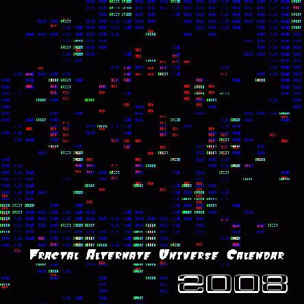
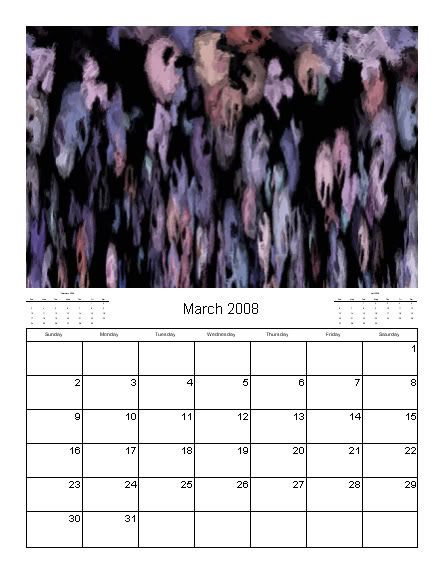
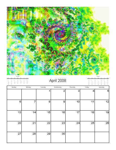
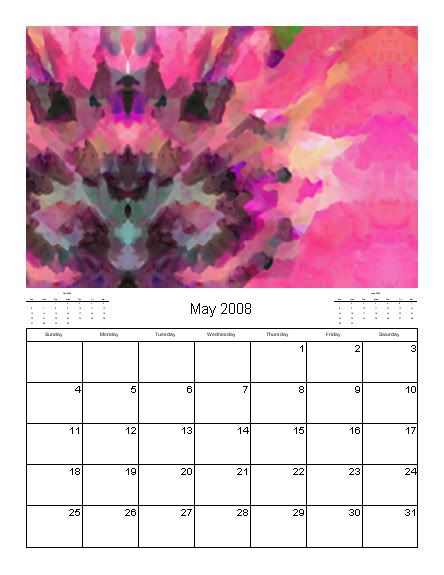
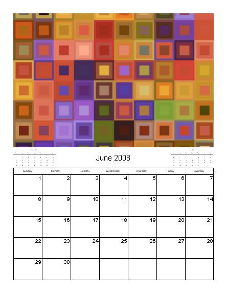
The Fractal Alternate Universe Calendar 2008

"For some folks I write a profound, richly articulated blog posting, and for others I just draw a picture."

Here's my latest commentary on the Fractal Universe Calendar: The Fractal Alternate Universe Calendar.

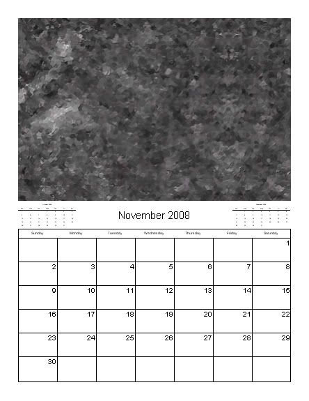
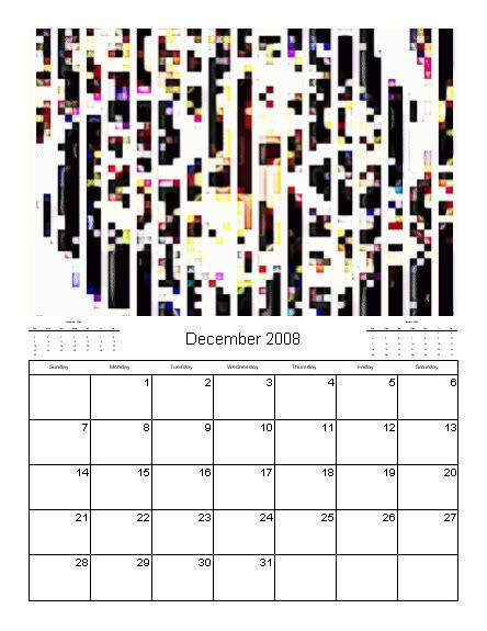
I made the cover for the Fractal Alternate Universe Calendar, so I'm especially proud of it, despite the lack of a cash bonus.

I think it's a much better way for me to express my artistic thoughts about the calendar in a form which I feel is more illustrative.

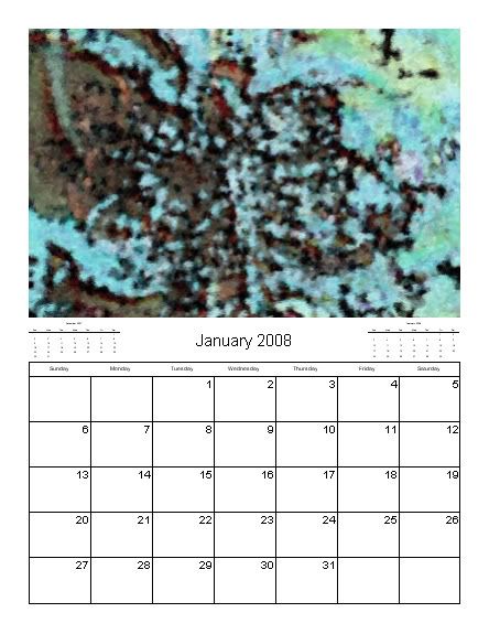
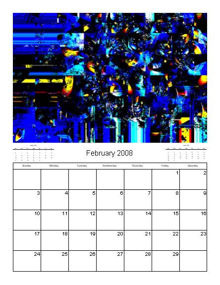
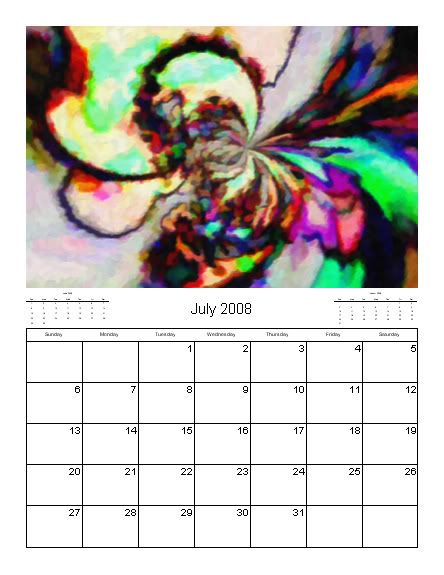
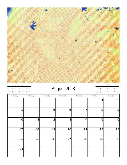
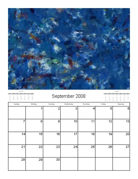
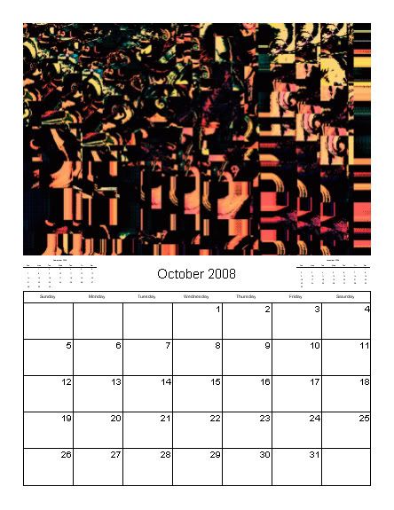
What makes it especially exciting is the way in which it was made. In order to suggest the possibility of life on other planets in the fractal universe (and how it might have evolved) I've taken my share of the original images from the 2004 Fractal Universe Calendar and exposed them to damaging levels of graphical radiation that would normally be screened out by the Van Allen Belts of the fractal world.

Compare the 2004 Fractal Universe Calendar images to each of the Fractal Alternate Universe Calendar images and see if you can match the original to the "alternate". Remember, my share have been run through several of my photoshop filter machines, so this a chance to use your forensic art skills and put flesh back on the bones (once you've put the bones back together).

Of course, in most cases you might need to do digital DNA testing to be sure, but each one of the months in the Fractal Alternate Universe Calendar started out as one of the 2004 Fractal Universe Calendar selections. That's why it's called it the Fractal Alternate Universe Calendar.

I know. Spectacular idea, isn't it?

I hope this Fractal Alternate Universe Calendar will help all of Orbit Trap's loyal readers come to a better understanding of my opinion about the artistic style of the Fractal Universe Calendar.

...And it's free! Go ahead, save the images or download the whole thing and print out a copy for yourself. It's my Christmas gift to all those fractal artists who've been dreaming of visiting other worlds in the fractal universe and might be encouraged by seeing a few moon rocks first.

---Tim Hodkinson


FAUC: Cover


FAUC: January 


FAUC: February 


FAUC: March 


FAUC: April 


FAUC: May 


FAUC: June 


FAUC: July 


FAUC: August 


FAUC: September 


FAUC: October 


FAUC: November 


FAUC: December 


~/~

Kudos to the people who got off their backsides and did something, I say. Their detractors should be prepared to put their own time, effort and maybe money into a venture if they want something run differently, not just sit in a corner gnashing their teeth, spouting insulting untruths.
--WelshWench

Okay.

It's a deal.

Damien M. Jones once defended his odd protocols (like mixing the judges with the judged) in the Benoit Mandelbrot Fractal Art Contest by saying "at least I'm doing something." Well, now so am I.

I helped contribute to the Fractal Alternate Universe Calendar. In keeping with the traditions of the original Fractal Universe Calendar, the work is heavily weighted to showcase the work of the editors.

Like my "Energy Vampire" series, the works that served as a base for the images in the FAUC were initially found (in a previous life) in the 2004 FU Calendar. They've been digitally pulverized and pixelly reconstituted, though. And why should this surprise anyone? Isn't this process just a variation of what most Ultra Fractal artists do? You know, pancake together layers of multiple parameter files mostly written by other people? No wonder so much of what appears on the original FUs look so similar.

Am I trying to make a big art statement here? Nope.

Am I taking a cut of the pie for this calendar? No way. It's free.

Did I include all of my friends in the calendar? Absolutely not. Well -- maybe one.

Terry
Rooms with a View
Blog with a View

~/~

Technorati Tags: , , , , , , , , ,

Monday, December 03, 2007

Test-Tube Art


Inkblot Kaos parameter file


Back to fractals. I think I did something to the other machine. It's leaking oil, or something. I smell something "electrical", too.

My seven year-old daughter was recently invited to a birthday party. While we were looking around in the Barbie Doll aisle of a department store for a suitable present, me and my nine year-old son came across a misplaced item --TEST-TUBE ALIENS.

I can't imagine who would put down a kit for "making" aliens in a test-tube and choose a Barbie doll instead because my daughter soon shared our interest in this hand-held Easy Bake oven for mutants. Some poor girl must have gotten a Barbie doll after her mother intervened and told her she'd probably have a lot more fun with a glamour pageant Barbie doll than the TEST-TUBE ALIENS that she picked up on the other aisle (where all the exciting, boy's stuff is).

My interest in the TEST-TUBE ALIENS subsided somewhat after reading on the back that there were three or four different kinds, and they all had pre-detremined names -- and predetermined shapes too, it seemed.

That's no fun. I was expecting something more along the lines of a genetic experiment with such scrambled genes that the back of the box would only speculate on what they might look like and offer a guarantee that what crawled out of the test-tube wouldn't threaten the human race with extinction. Ideally, it would also have come with a small handgun for terminating the experiment should things get out of hand... chains break, radio-activity be detected.

Guys like me won't be designing children's toys anytime soon.


Inkblot Kaos parameter file


Fortunately fractal programs are also test-tubes -- digital ones -- and have very few restrictions on them, which makes for hours and hours of frightening recreation. The results aren't always pretty, but for the mad scientist in the family, they are rarely boring.

Now if you'd prefer to take a look at the Barbie doll aisle instead...

...

What? Did I go too far again?

Well, it does seem to be a popular calendar, and even if it isn't, what's wrong with people liking a type of artwork that's different from yours?

Alright, sure, folks Christmas shopping in the mall might "like" that sort of thing, or at least buy it, which isn't really the same thing as saying they think it's great artwork... but it's incredibly cliche isn't it? It makes fractal art look like it's nothing more than a children's pin-wheel display. That's not "arty" artwork.

"Arty artwork"? Sounds like some new animal species. I think you've become a test-tube experiment yourself, man. Maybe you should have a warning label.

Hey! You're just my conscience. You're not suppose to insult me. You're supposed to act like Jiminy Cricket and give gentle advice and reminders, like when I'm totally wrong and steadily slipping into a muck hole of depravity.

Alright. Sorry -- sorry for having a sense of humour! But back to your impolite comments about the Fractal Universe Calendar; I'll try to be more Jiminy Cricket-like. I find the calendar's choice of artwork to be a profound statement of time and very appropriate for what really is the current state of fractal art.

You're joking again, right?

No, I'm serious. Every year, the same old stuff, reworked by a few people and slapped with a new label: 2005; 2006; 2007... In the words of Samuel Becket, I think, "Nothing ever happens". You see? That really is the current state of fractal art: a handful of people doing the same old thing every year.

Hmmnn. That's quite interesting. I didn't think my conscience would ever come up with anything so cynical!

You're having a bad influence on me. I'm going to ask to be reassigned.

technorati tags: | | | | | | | | |

Saturday, December 01, 2007

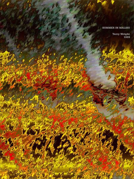
Summer in Malibu

Summer in Malibu

Summer in Malibu (1999)

Nine campers view photos
of longboarders and swells of smoke.
Hot Hub said industry crosstalk.
Click the link to flame on and off

premises. Dry weather, a tourist,
checks in and tan lines glow
white hot. Wet suits curdle. Surfers
crawl a foam floor nosing

wipe out exits. The coast highway
burbles plastic, cut by lasers.
Santa Ana blew back in from Texas
till stars flared on hillsides.

~/~

Hot Property

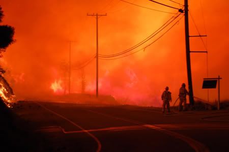
Firefighters fighting the Malibu fire in Carbon Canyon, 2007

Photograph by Adam Housely

From "Let Malibu Burn: A Political History of the Fire Coast" by Mike Davis:

Fire in Malibu has a relentless, staccato rhythm. The rugged coastline is scourged by a large fire, on average, every two and a half years, and at least once a decade a blaze in the chaparral grows into a terrifying firestorm consuming hundreds of homes in an inexorable march across the mountains to the sea. In one week last month, 10 homes and 14,000 acres of brush went up in smoke.

[...]

From the very beginning, fire has defined Malibu in the American imagination. Sailing northward from San Pedro to Santa Barbara in 1835, Richard Henry Dana described (in Two Years Before the Mast) a vast blaze along the coast of Jose Tapia's Rancho Topanga Malibu Sequit. Despite (or, perhaps, because of) Spanish prohibition of the Chumash and Gabrielino Indians' practice of annual burning, mountain infernos repeatedly menaced the Malibu area throughout the 19th century. During the boom of the late 1880s, the entire ex-Tapia latifundium was sold at $10 per acre to the Boston Brahmin millionaire Frederick Rindge. In his memoirs, Rindge described his unceasing battles against squatters, rustlers and, above all, recurrent wildfire. The great fire of 1903, which raced from Calabasas to the sea in a few hours, incinerated Rindge's dream ranch in Malibu Canyon and forced him to move to Los Angeles, where he died in 1905.

[...]

While county crews were still racing to the scene, the implacably advancing fire ambushed its first victims at a ranch a few hundred yards downhill from the water tanks. Miscalculating the fire's velocity, residents Ron Mass and Duncan Gibbins foolishly attempted to defend their homes with a garden hose. They recognized their mistake almost immediately, but it was too late. Mass jumped into his Jeep, but the fire caught him before he could get out of the driveway. Hideously burned, he managed to stagger to the edge of Old Topanga, where firefighters saw him, his blistered arms "outstretched like a scarecrow." British screenwriter Gibbins, meanwhile, had dashed back to rescue his cat. He ran right into the fire's deadly thermal pulse. It charred 95 percent of his body. Paramedics later discovered him, barely conscious, in the ranch's swimming pool. "'I don't want to die,' he said over and over," recounted the Times. "Smoke poured from his mouth, and he talked in the terrible high-pitched squeal of a man with lungs scorched beyond repair." (Gibbins died later in the hospital, but Mass survived his third-degree burns.)

[...]

Malibu at dusk was a surreal borderland between carnival and catastrophe. Nonchalant crowds played video games on the pier while television news helicopters hovered overhead like noisy vultures and the Coast Guard cutter Conifer stood offshore, ready to evacuate residents. Beneath the flaming hills, the Pacific Coast Highway was paralyzed by a hopeless tangle of arriving fire trucks and fleeing Bentleys, Porsches and Jeep Cherokees. Hundreds more locals trekked out on horseback, by bike or on foot. A few escaped on skates. Three hundred Sheriff's deputies were brought in to guard against looting. The chaotic exodus was oddly equalizing: panicky movie stars mingled with frantic commoners. Confronted once again with its a destiny as a fire coast, Malibu replied in the vernacular. "This is hell, dude," one resident told the Times. "I'm expecting to see Satan come out any time now."

Although today's featured image was made in 1999, the firestorm cycle returned in 2003 and again just last month to wash through Malibu's hills and canyons like a brimstone heavy.

There is nothing wrong with making beautiful fractals -- or engaging in art for art's sake. But like all good art, fractals can and should travel other roads not taken -- political-social-cultural expression, mirrors to nature, and humor (including sarcasm and irony).

Or historical documentation -- which, at least for today, burns the most fiercely.

~/~

Rooms with a View
Blog with a View

Original poem, 2007. Image originally made in Sterling-ware and post-processed until blowback produced a blue screen of death.

Technorati Tags: , , , , , , , ,