Friday, May 30, 2008

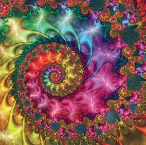
Image of the Week: Paul DeCelle

Moment in Blue by Paul DeCelle

Moment in Blue by Paul DeCelle

Ultra Fractal is certainly versatile but too often images produced with it quickly lose their freshness to my eyes. The reason is found in its composing process in which striking new formulas are shared and then widely stepped on by the throngs of UF users. Once these variations-on-a-theme floodgates open, what was initially novel quickly can become drowned in a backwash of mass replication. This rapid, consumptive cycle is probably why I can usually tell immediately when an image was made using Ultra Fractal. It is also why I have reservations about the Mississippi School of Anti-Fractal Art™ teaching classes in the use of UF. Sign up today and soon you'll be speed cloning the styles of others in no time!!!

So it's always a surprise and a delight to see an artist use UF in a completely unexpected way. I'm not surprised, though, that the latest revelation comes from Paul DeCelle. He has long been on a quest to find new ways to coax fine art out of UF. His current knock-offs of abstract art pieces are the most exciting UF work I've seen since Jock Cooper rooted around in Bryce to create the stunning works found in his Mechanical Gallery.

Today's image of the week is what DeCelle calls a "UF rendition" of a painting by constructivist artist Lars-Gunnar Nordström. You can compare DeCelle's rendering to Nordström's original here. DeCelle has a number of these abstract renditions displayed in his Renderosity gallery, including other works by Nordström. As they say in ad agencies, DeCelle's re-creations certainly "break through the clutter" of the deluge of the usual UF and Apo fare. DeCelle is to be commended for taking risks and for revealing the wonders of a kind of digital cubism. He could have been content to reap oohs and aahs for burnished metal spirals he can probably crank out in his sleep. Instead, he has successfully opened up fractal art to a new way of seeing.

To their credit, the Fractalbookers at Renderosity understand DeCelle is on to something good. Unfortunately, they also have a serious case of artistic poison ivy and are itching to pry open DeCelle's secrets to keep fractal assembly lines well oiled. And, with a sigh, I suppose the spirit of open source sharing will triumph in the end. Soon, the enigma of DeCelle's process will be revealed for dissection on the UF List. Then, once the tweaking feeding frenzy begins, how long will it be before fractal renditions of poker playing dogs and Elvis on black velvet begin to re-clutter the galleries of art communities and smother what was once vibrant?

I remember what an aesthetic kick it was when I first saw UF work done using BringItIn. But, within a week, my eyes were stabbed when they were subjected to my first spiral-made-with-kittens. After that, every BringItIn-enhanced image just made me want to gack up a hairball.

So, readers, enjoy drinking cream before it turns sour. Here's hoping that DeCelle continues to share his ground-breaking work but keeps his mysterious secrets secret -- at least until I can stock up on a few cases of Maalox.

Tags: , , , , , , , , , ,

Contests for Dummies

Chapter One: What is a contest?

"an occasion on which a winner is selected from among two or more contestants"
wordnet.princeton.edu

"A contest, is an event in which two or more individuals or teams compete against each other, often for a prize or similar incentive."
wikipedia

"1. A struggle for superiority or victory between rivals.
2. A competition, especially one in which entrants perform separately and are rated by judges."
thefreedictionary.com

 
Chapter Two: Art Calendar Contests - A Few Examples

Example #1
The Knitty 2007 Calendar contest!

Have you knit something from a Knitty pattern? Yahoo! You're eligible to enter!

The 2006 Knitty Calendar Contest was a huge sucess, so we're doing it again! Now's your chance to share your gorgeous work with all our readers!

We're looking for the best, most enticing, amusing and well-shot photographs of items knit from Knitty patterns. We'll select the 12 best and publish them in our second calendar, this fall, for 2007. And the best of those 12 will go on the cover and get some seriously fabulous knitworthy stuff! Read on!

PRIZES

Grand prize:
One [1] of the 12 runner-up winners will be chosen to be on the cover of the calendar.

Runners-up:
Twelve [12] winning photographs will be selected to fill the pages of the Knitty 2007 calendar. Each winner will receive one [1] copy of the Knitty 2007 calendar and will be fully credited in the calendar [right on their photo].

from the rules...
Knitty staff are not eligible for this contest [that means the catalyst, editors, columnists, technical editor and myself].


Example #2
Another calendar contest from the quilting world: 2009 Quilting Arts Magazine Calendar Contest

Example #3
Illinois Work Zone Safety Calendar Contest

From the contest site:
"The contest judges have cast their votes and have determined the winners of the 2007-2008 Illinois Work Zone Safety Calendar Contest! Congratulations to the following 12 finalists"

Example #4
Space Settlement 2009 Calendar Art Contest
To bring attention to our goal of creating a spacefaring future, NSS is sponsoring a contest for such artwork to be used in a calendar promoting a future of humans living and working in space. The best of the submitted artwork will be selected for inclusion in the 2009 NSS Space Settlement Calendar.

For the Grand Prize winner:
* Publication as the cover of the National Space Society 2009 Space Settlement Calendar

For each of the four First Prizes winners:
* Publication in the National Space Society 2009 Space Settlement Calendar

For the remaining 7 winning entries:
* Publication in the National Space Society 2009 Space Settlement Calendar

Judges

"To determine the winning entries in the National Space Society's Space Settlement Art Contest, we have selected a mix of internationally renowned space artists and space activists."


Example #5
WINNERS of the Energy Quest Art Contest
for California's 2008 Energy Calendar!


Example #6
The American Academy of Equine Art Calendar competition
The American Academy of Equine Art is planning to produce a 2009 Calendar featuring contemporary equine art. We are looking for 12 feature paintings or sculptures plus one for the cover. Your work could be a part of this calendar. Just enter the competition. Submissions will be posted on this site. Each month the general public will vote on line for 10 finalists. At the end of the year, a jury of AAEA artists will choose the 13 winners from the 120 finalists. The winners will be included in the 2009 Calendar.


Example #7
Barn Calendar Contest
Twelve winners were chosen in the statewide Barn Again Calendar Contest, co-sponsored by the Nebraska Humanities Council, the Nebraska 4-H and the Nebraska Soybean Board, in conjunction with the traveling exhibit “Barn Again! Celebrating an American Icon.”

Nearly 300 participants each submitted a crayon drawing of an existing barn in Nebraska and a brief paragraph about the barn. All Nebraska students grades 3 through 12 were eligible.

Winners were chosen in three categories — junior (grades 3-5), intermediate (grades 6-8) and senior (grades 9-12). Three winners were selected in each category and three additional winners were chosen at large. All 12 artists received savings bonds.

The winning entries, which are displayed below, will be featured in the 2002 Beautiful Barns of Nebraska Calendar.


Chapter Three: Quiz Time!

True or False (7 questions)

1. The Fractal Universe Calendar is an annual Art Contest where entrants may each submit up to 10 Fractal Art images for judging. True or False

2. The Fractal Universe Calendar is a fractal art contest where the prizes are publication in the calendar and a few hundred dollars cash. True or False

3. The Grand Prize in the Fractal Universe Calendar fractal art contest is having your image used for the front cover. True or False

4. On average, over the years, approximately 40% of the prizes awarded in the Fractal Universe Calendar contest went to just four people who were all either current or former judges of the contest. True or False

5. In the 2009 Fractal Universe Calendar art contest, the Grand Prize (front cover) was awarded to one of the judges along with the largest cash prize. True or False

6. The "Editors" and supporters of the Fractal Universe Calendar deliberately avoid the use of the terms, "contest", "judge" and "prizes" (and consistently refuse to accept such terminology) because, as a contest, the Fractal Universe Calendar is blatantly unfair because it allows the "Editors" to judge the work of their fellow competitors while at the same time judging their own submitted artwork which is competing against the others for inclusion in the calendar. True or False

7. Only a complete idiot or a barefaced liar still maintains that the Fractal Universe Calendar is not a contest. True or False

Technorati Tags:

Wednesday, May 21, 2008

Darts for Keith

Welcome back all you faithful Orbit Trap fans to this week's episode of, "Image of the Week".

Well, as you may have guessed from the title, this review is not going to be pretty. Keep your shoes on. There's plenty of broken glass around in here.

As usual, I was surfing along on my way to something else when I hit this rock. Ouch.

I probably would have just gotten back on my surfboard and zipped away, except for all the contortionist back slapping going on and the hallowed heights this particular image was being raised up to. Keith was named as "Artist of the Month" there on Renderosity for May, and in the little write-up they had on him, he described this image as his "most recent favorite".


Rainbow Garden by Keith Mackay (Deagol on Renderosity)


As many people in the fractal art world are aware, Keith has done some very impressive work assembling fractal images to make up complex scenes like coral reefs (complete with fish) and flower-like arrangements that are very eyecatching, unique and popular. I'm not knocking the guy for those, because for work like that Keith really is an example for others to study and ought to be praised for it. That sort of work isn't easy to do and requires real technical skill and opens up all sorts of creative possibilities for fractal artists.

But the image he describes here as his "most recent favorite" embodies everything that I think makes Fractal Art cliche and boring.

It's not because it's a spiral. Spirals can be a very versatile and fertile sub-genre of their own and are capable of producing new and interesting imagery (in what has now become a classic fractal theme) when dealt with in creative ways (note the word, "creative"). This one here, however, doesn't show any of that sort of creativity and is just a very dull, and uninteresting spiral. The coloring (which is often what saves mediocre work like this) isn't particularly interesting or creative either. What is this thing good for?

The Fractal Universe Calendar! It wouldn't even look out of place if it was featured on the cover.

It's funny. I guess I must be the only person who didn't know this image had already been picked for the 2009 Fractal Universe Calendar. I wasn't even aware of that when I started to write this posting. It wasn't until I went looking for links to include that I started to read some of the (very flattering) comments posted on its gallery page on Renderosity. (Whoa. A lot of folks really love this one!) One of those comments congratulated Keith on having the image chosen for - the cover! That's how and when I discovered that what I had been joking about in my posting had already become reality.

"The stuff piles up so fast in the Fractal Art World you need wings to stay above it" (Martin Sheen, Apocalypse Now, ...more or less).

Why don't they put some of Keith's good stuff in the Calendar? Keith also makes artwork that is very professional looking and original. His fractal flame assemblages I mentioned earlier, although not really my sort of thing, personally, have a thousand times more creativity and interest to them than these cheap plastic pinwheels. Can it really be that people would rather look at those worthless spirals instead? Why not just one image that's a little different? It would sure make the "horrendous" job of editing easier. At least it wouldn't be so hard to tell the images apart when they're "sorting" them.

I can honestly say that I consider the Fractal Universe Calendar to be an embarrassment to Fractal Art. It's not even good eyecandy, its just a lot of mediocrity, rehashed year after year; variations on a theme that was already boring 10 years ago. All it's doing is perpetuating the stereotypical image that people have of fractal art as being stupid wispy spirals. Keith's front cover up there is a prime example of what has come to be an annual collection of the most shallow, juvenile, tasteless fractal art imaginable.

Well, there you have it folks. That's all the time we have tonight. Tune in next week for another fresh and never before seen episode of Image of the Week.

Technorati Tags:

Saturday, May 17, 2008

Image of the Week: Stacy Reed

A Farewell to Regret by Stacy Reed

A Farewell to Regret by Stacy Reed

Popular fractal programs certainly take their share of hard knocks. Apophysis, for example, seems to fiind itself frequently floating in critical backwash, and here on OT we've been known to take a few shots at Ultra Fractal (and still have more to say on that subject). But it isn't the fault of the program if some art communities get overrun with fractal kudzu pumped out of these generators like a sewage treatment plant running at full capacity. A program is only as good or bad as its practitioners.

In the right hands, any program, popular or not, is capable of producing breathtaking work. Sometimes, when I sour on the homogenized glut of Apo and UF images crowding the Fractalbook niches of communities like Renderosity and deviantART, it's refreshing to visit galleries by artists the caliber of Paul DeCelle and Dan Kuzmenka to see how Ultra Fractal can be stretched -- or to hang out with the Faber Brothers to remind oneself of Apo's versatility. Other artists, like Harmen Wiersma or Maria K. Lemming have forged and found potent individual styles that supercede whatever programs they use. These are the kinds of artists I will be likely want to spotlight on a bi-weekly basis when OT's Image of the Week swings around to me.

A visit to Stacy Reed's She Dreams in Digital site is a good place to start though. There's plenty to see (and hear) besides the art, including photos, music, informative articles, engaging links, and a desk even messier than my own. But it's Reed's art made with Apophysis that keeps me clicking my bookmark.

At times, Reed's work reminds me a little of Karin Kuhlmann (see Blackbird Fly), although Reed prefers a less painted and more unsaturated look. Reed also, to my eyes anyway, creates more tension and energy in her work than most Apo users can muster. This is likely achieved through careful attention to both perspective and absence. Look how measured placement of light draws attention to the focal points in Abstract Fractal -- Floral. Reed tells us she's just "messin with stuff," but I expect a keen eye complements serendipity here. Seduction is another stunning, minimalist image where absence, light, and (especially) motion powerfully evoke mood.

Reed is also drawn to including lyrics or poetry (as in the featured image above), usually by others, to accompany some posts in order to highlight correspondences. And, although I'm not much taken with mixing generated fractals with RL material (and here's a good objectification of why), the faint suggestion of sunlight and clouds nicely calls attention to the recherché detail in Mystical Tree.

Have fun exploring Reed's blog/site. Prints are available. Don't blitz by the sculptures. And be thankful that her desk is not as messy as it used to be.

Tim will be back next week to review another image and artist. Until then...

Tags: , , , , , , , , , ,

Tuesday, May 13, 2008

Spleen

Spleen

Spleen (2008)

[Click on the image above to see the view with binoculars.]

The first section, entitled "Spleen et idèal," opens with a series of poems that dramatize contrasting views of art, beauty, and the artist, who is depicted alternately as martyr, visionary, performer, pariah, and fool. The focus then shifts to sexual and romantic love, with the first-person narrator of the poems oscillating between extremes of ecstasy ("idèal") and anguish ("spleen") as he attempts to find fulfillment through a succession of women...Each set of love poems describes an erotic cycle that leads from intoxication through conflict and revulsion to an eventual ambivalent tranquility born of memory and the transmutation of suffering into art. Yet the attempt to find plenitude through love comes in the end to nothing, and "Spleen et idèal" ends with a sequence of anguished poems, several of them entitled "Spleen," in which the self is shown imprisoned within itself, with only the certainty of suffering and death before it.
--Barry Veinotte

~/~

From the "Flowers of Evil' series. Poem by Charles Baudelaire. Translation by William Aggeler.

Image made with Orca. Post-processed until it became just another disorienting encounter.

~/~

UPDATE: The third image in this series can be seen on my blog.

Tags: , , , , , , , , , , , ,

Sunday, May 11, 2008

To the Reader

To the Reader

To the Reader (2008)

[Click on the image above to see the view with binoculars.]

The poems [in Flowers of Evil] found a small but appreciative audience, but greater public attention was given to their subject matter. The principal themes of sex and death were considered scandalous, and the book became a by-word for unwholesomeness among mainstream critics of the day. Baudelaire, his publisher, and the printer were successfully prosecuted for creating an offense against public morals. In the poem "Au lecteur" ("To the Reader") that prefaces Les fleurs du mal, Baudelaire accuses his readers of hypocrisy and of being as guilty of sins and lies as the poet.
--Language is a Virus

Flowers of Evil is perhaps the most influential book of poems of the nineteenth century. The title, like the poems themselves, establishes a dialectic between beauty and sin. A flower usually evokes the beauty of innocence -- of nature in fragile, expectant bloom. But, the poet posits, is there not beauty as well in the excesses of nature, in the ugly aspects of being, in an amoral life? Is not even -- or especially -- the freshest flower always on the verge of decay? Baudelaire adored lust, ennui, and avarice. He opens his collection of poems with an address "To the Reader," which announces both his own and his addressee's propensity for falseness: "You -- hypocrite reader -- my twin -- my brother." Within us all lie the flowers of evil.
--ArtandCulture

~/~

From the "Flowers of Evil" series. Poem by Charles Baudelaire. Translation by Robert Lowell.

Image made with Orca. Post-processed until it became both putrid and sublime.

Tags: , , , , , , , , , , ,

Thursday, May 08, 2008

Kudos to Kerry

We're starting a new weekly feature here on Orbit Trap. Every week we'll be reviewing an interesting piece of Fractal artwork.

This is nothing radical, of course; many sites do this sort of thing, but here on Orbit Trap it's going to be much more exciting and lively.

I thought I would launch this regular weekly feature by reviewing a very well done piece of Fractal Artwork by Kerry Mitchell, an artist everyone in the Fractal Art world probably knows of.

It's not one of his recent works; the collection's dated August, 2004 on the Ultra Fractal website. I know many artists prefer to have their current works reviewed rather than things they've done a few years ago, but I think this one has such a strong sense of style that it's worth taking the time to take an extra-careful look at this one.


Arabesque by Kerry Mitchell
(Click image for larger version)


Simply put, what I like about this image is that it's an excellent presentation of what could be called "classic" Fractal Art, and directs one's attention directly to the elegance of the fractal formula. If you don't like images like this, then you don't like classic, hard-core Fractal Art. (Yes, there is such a thing).

Everything that has been done to the image compliments and enhances the appearance of the fractal imagery and doesn't obscure it or steal your attention from it. In fact, the image has a very natural, almost photographic look to it.

If one was flipping through a coffee table book on Arab artwork and style and saw this image, few people would question it's reason for being included, although they might comment on it's unique appearance. No doubt, that's why Kerry named it "Arabesque".

It's interesting, the little mandelbrot man in the center almost looks like a key hole on some elaborately made jewel box or cabinet. And the darker gold background has a very realistic looking enamelled appearance.

From the notes for the image:

This image was created with a formula that combines the Mandelbrot and Newton fractals. The 3D effect comes from a coloring technique that mimics the look of embossed paper.


The embossing effect I think is what gives the fractal pattern such a stunning display. I've seen this effect used with other fractal images elsewhere and it's not always done this tastefully; here it's just enough to bring out the pattern and raise it up from the background and not create a high contrast moonscape (although that can be fun sometimes, too).

There's a funny story about how I stumbled on this image. It was back in June of 2007, or something, when I was working out my personal thoughts on Ultra Fractal and trying to see as many examples of UF work as possible. Naturally, I started with the official, UF site.

I was looking for examples of excessive layering and smudgy, syrupy sorts of things. I was quite surprised when I came across this. Although I'm sure it's not an overly simple image, it's complexity accentuates the simple beauty of the fractal formula. In fact, I suppose this image could be displayed just as easily in a math textbook as it could in an art gallery. Far out, eh?

Stay tuned next week folks, for another exciting episode of Orbit Trap's featured artwork selection. The image could be yours, it could be your neighbor's, it could be from someone you've never heard of! It will, however, be noteworthy.

Technorati Tags: