Friday, July 24, 2009

Infinite Jest?

Slimazoids Visit Gnarlinspike Badlands

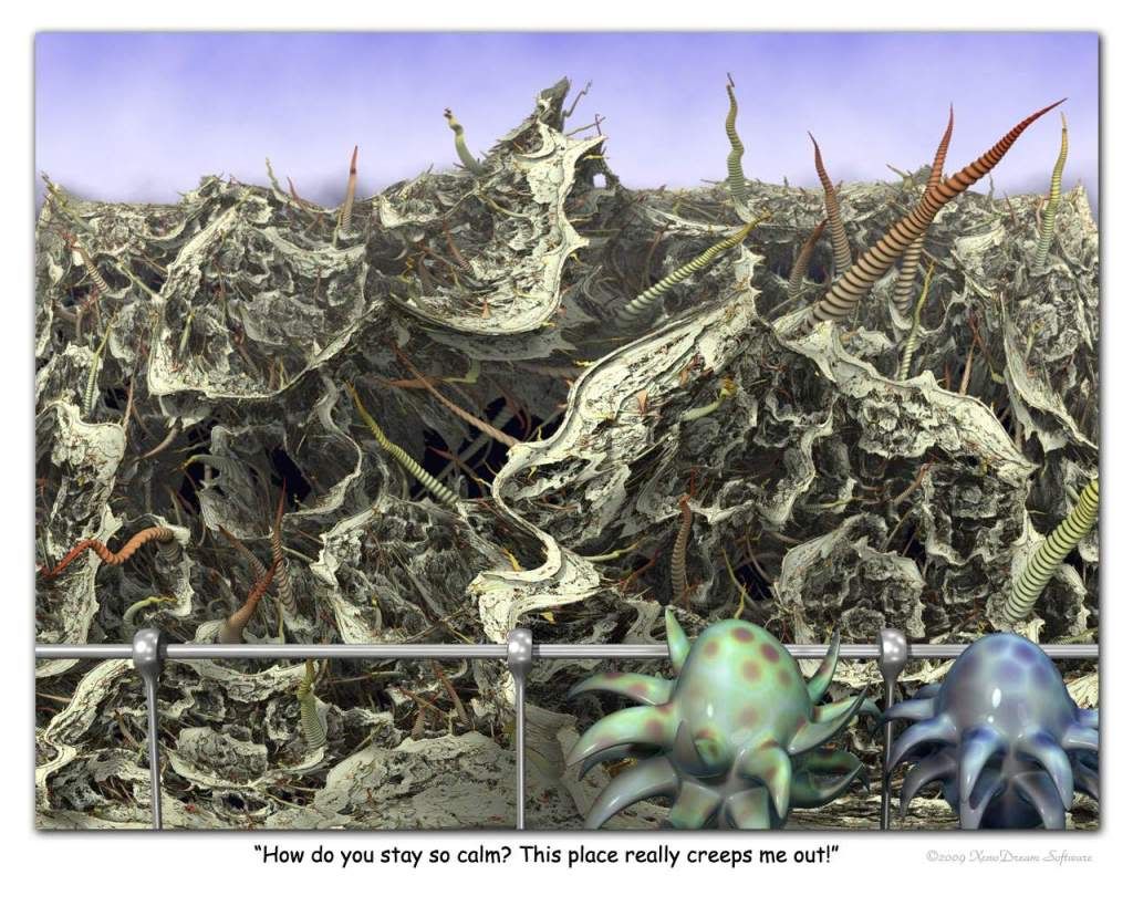
Slimazoids Visit Gnarlinspike Badlands by Garth Thornton.

Posted to Fractal-World.

One of the hardest parts of my job is figuring out what other people will think is funny. You’d think that would be easy, but my own sense of humor is far from the mainstream. I can’t assume others will laugh at the same things I find funny.
--Scott Adams, Dilbert cartoonist

Tap. Tap tap. Is this thing on?

Oh. Hi. Hey. Thanks for coming. Say. If you're like me. Have you ever wondered...

What's easier artistic material? Tragedy or comedy?

As a writer, I've always found comic themes more difficult to pull off than tragic ones. Maybe that's because most of us are more likely to agree on what constitutes a tragedy. But evoking laughter in a reader -- well, good luck.

And I wonder if amusing a viewer with a visual image isn't twice as difficult. After all, the perceiver of the image generally has only visual cues for clues. Often, there's no narrative set-up. No underlying context. No cathartic punch line.

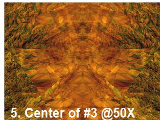
Garth Thornton, one-half of the creative team behind Xenodream, walks the fence very effectively in the image above. The caption provides the context for appreciating the joke -- that is, there is a deliberate, conscious attempt to steer viewers to see Thornton's humorous point-of-view.

And, really, there's nothing wrong with guiding viewers to intended interpretations. There have been discussions back in Orbit Trap's salad days over whether images have inherent political content -- or if such a subtext is created only by the act of titling. Some fractal artists insist on not titling images, or are prone to using only numerical titles. Such practices, they argue, do not pressure viewers into making assumptions about thematic content and allow the broadest latitude to form individual interpretations.

My response would be that viewers are always free to forage in images and come up with their own idiosyncratic, thematic angles. Titles and captions don't contaminate interpretation; they merely suggest one possibility that occurred to the artist. And why shouldn't artists provide viewers with possible road maps, especially if artists hope to imply political, social, technological, horrific, and, yes, even comic overtones.

But humor, because it is so inherently subjective, is extremely hit or miss. And all the more so if visual clues come off as vague or garbled when "read."

I'm certainly not the first artist to dwell on this subject. From "'Snot Funny: Humor and Art" by Kate Alexander:

It is difficult to think of humor and intellect as going hand-in-hand: just like the divisions of mind and body, humor is considered base, and mutually exclusive to higher cognition. After all, humor is very corporeal: laughter is the physical response to something funny. If you have any doubts of this, just consider these questions: did Jesus laugh? Can you imagine Muhammad telling a joke? Or Buddha, mid-meditation, passing gas and giggling?

This very issue has repercussions in art as well. The function of art has, for several centuries now, been expected to fulfill some philosophical purpose. Art is supposed to make us think. This especially overwhelmed art in the wake of the Conceptual Art movement, as artistic skill was thrown out the window, and the "idea" reigned supreme. It is thus that we separate the high arts from the low arts: art that is "funny" is not respectable.

[...]

But, some might say, if the separation of high art and low art did not exist, art would be indistinguishable from mere "entertainment:" a Peanuts comic strip would be as aesthetically valuable as a Bruce Nauman; Will Ferrell would be more of a mover-and-shaker than Sol LeWitt; Andy Samberg's crude SNL digital shorts would be as artistically legitimate as a Jean-Luc Godard film. I myself try to fight the elitist reputation of art historians, but all I have to say is: yikes.

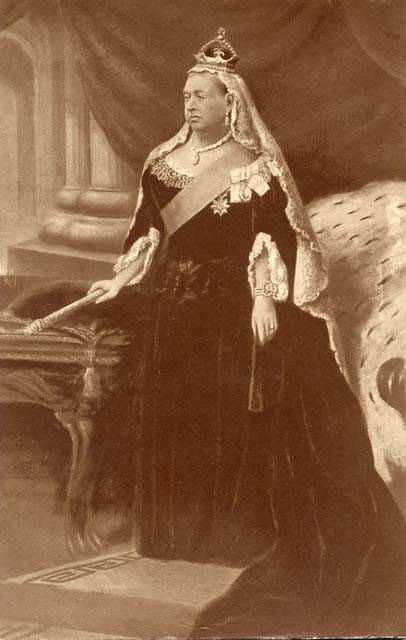
The profiling couldn't be any clearer. Tragedy is high art. Comedy is lowbrow. The plank to the back of the head in Laurel and Hardy. The poke in the eyes by Moe Howard. The snickering you try to stifle when a friend clumsily misses the last stair step. These are the pulled fingers of low culture. The true intelligentsia prefers a more royal approach: We are not amused.

Yes, it's far easier to show angst and anger in one's art -- or just title an image with some ominous, obtuse phrase to ensure maximum heaviness. Like Nascar Bazaar. Or throw out reason entirely and just make shit up on the spot like Janet Parke. How about: Tressione. Or: Asundriana. Well, are you laughing -- or bowled over by the ponderous connotations -- or just beginning to feel the first flushes of weepiness?

It's far easier to imply something serious than it is to venture into comedy's minefield. After all, exactly what kind of a reaction do you intend? Which of the following do you hope your freshly minted comic image brings forth: mild amusement, a touch of mirth, extreme rib-tickling, presidential smirking, ironic elbowing of shared insights, sarcasm leading to furious fist-pumping, slapsticky pratfall guffawing, parody or insult or blunder or pranking? Look at all the wrong exits your poor viewer can take. Maybe that's why titles or captions can sometimes serve as a kind of pre-set, interpretive GPS system.

Still, it's so easy to get lost in the comedy forest:

The Lion Just Woke Up

The Lion Just Woke Up by Maria K. Lemming

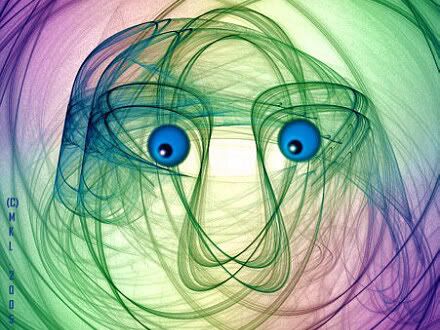
Pretty funny, huh? Or, is it? It depends, I suppose, whether you feel the lion is:
1) sleepy, and has a groggy, foggy look that suggests a bit of whimsy, or
2) startled, and thus p'unked upon awakening to find you inexplicably hanging about the lair, or
3) hungry, making you potential and available cat food and the whole situation definitely not funny.

Or, how about this -- an image that shares some stylistic attributes with the previous one, yet does not necessarily lead to the same responses:

Hurry to Dress

Hurry to Dress by Elenyte Paulauskas-Poelker

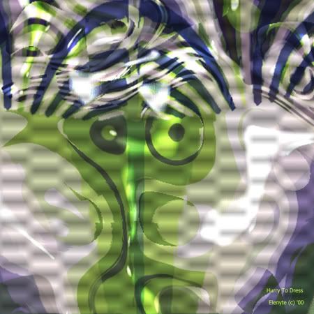
Is this funny? I guess it's your own call. Poelker's image always makes me smile, but I'd be hard pressed to explain in depth why I think it's funny. Something about its mix of implied chaos, a frenzy found in that captured moment, and the abstract, contorted body desperately trying to squeeze into clothing. Maybe you find all of this too familiar and therefore depressing. I don't know. Can't you see I've wandered into dangerous waters here? I mean: if you have to explain the joke, then...

Finally, mixing math and humor tacks on another grievous level that can result in blank looks rather than laughter. After all, "fractal humor" is probably a sub-genre of the broader "scientist humor" field. Often, such jokes rely on a rudimentary understanding of some genre-specific jargon and arcane knowledge. Here's a case in point. First, study the image, which appeared in the "Fractal Humor" section of the FractalForum message board:

Malformed Child

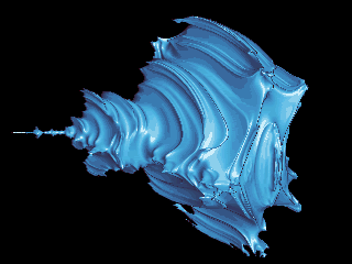
Malformed Child by Dave Makin.

Posted to Fractalforums.com.

Now, follow along carefully as Makin lays out the joke for you:

This is z^2+c where z and c are a 3D system i.e. not fully 4D.

It looks like the malformed offspring of a quaternionic Mandy and a hypercomplex Mandy [smiley].

Well, kids, isn't that funny? Isn't it? Or, as they say, did you have to be there?

Tags: , , , , , , , , , , , , , ,

Tuesday, July 21, 2009

Xaos 3.5 is here!


Cool fractals made chillingly easy (Parameter file: "fract0.xpf")
Xaos Website


So simple


What's new in 3.5? Glad you asked.

XaoS 3.5 has been released for download. This version contains a new Portuguese translation, several bug fixes, and some UI improvements for the Windows version.

So maybe I over-reacted. I find their use of version numbers is a little strange. 3.2 added language support for Romanian. 3.3 added a formula parser.

And what about 3.4?
In addition, 3.4 includes several fixes and improvements to the native language support and translations. The most significant of these is that accented characters are now displayed correctly on modern systems.

I'm going out on a limb here, but I think they're reserving the big 4.0 version number for the introduction of Esperanto.

The formula parser is the big deal now with this program. Before you were limited to the dozen or so hard wired formulas and their 6 variations in different planes. Most of the formulas were interesting to look at for a little while and probably made for a nice introduction to fractals but there were only a few that you could really do much with. The formula parser changes all that although (like most formula parsers) it can be a little slow.

But now at least there's an unlimited number of formula options by which to make use of Xaos' great rendering capabilities. Xaos has the best random color palette generator of any fractal program that has ever been made and probably ever will be made. Combined with it's simple edge detection filter (which was used to give the above sample images their line drawn look) it multiplies the creative possibilities of what may appear to many fractal artists as a rather simple fractal program.

I don't know who or how many people use Xaos in serious way to make fractal art. My impression has always been that the number is few. Most fractal artists seem to prefer Ultra Fractal and Apophysis. But I think Xaos, despite it's simple and small-town look, is an algorithmic art program of the highest quality and one of the most creative tools that a fractal artist can find. One should never underestimate the importance of color and Xaos is virtually a magic wand of creative coloring. A few taps of the shortcut key "P" on your keyboard and you'll see what I mean.

In addition to all that, Xaos has some other well-known but still worthwhile creative tools. Fast Julia mode (push "J") enabled me to create the above images from a rather simple user-defined formula ("COS(Z^2+C)/C"). In fact, here's the parameter file for the above image (the white one is just the black one inverted in a graphics program).

;Position file automatically generated by XaoS 3.5
; - a realtime interactive fractal zoomer
;Use xaos -load to display it
(initstate)
(filter 'anti #t)
(filter 'palette #t)
(filter 'edge #t)
(palette 3 3071 0)
(formula 'user)
(usrform "COS(Z^2+C)/C")
(usrformInit "")
(juliaseed -0.97127736087806896001 0.56929235238298683524)
(incoloring 9)
(julia #t)
(plane 6)
(view -5.60 34.9 83.1 83.1)


Note that there's a place for user formula initialization. Uh, I don't know what that means. But there's another custom parameter to experiment with when you've exhausted all your formula permutations of SIN, COS and the other cousins of trigonometry.

The beauty of Xaos is that the program places creative power at the touch of a single finger. That's what good, algorithmic programming does. It lifts us little folks up onto the shoulders of giants.

Direct Download link for Xaos 3.5 (for Windows)

Thursday, July 16, 2009

Rich Jarzombek's Technique

Editor's note:
(Rich Jarzombek's unique fractal artwork was originally reviewed on Orbit Trap back on April 28th as the posting, Realistic Fractals by Rich Jarzombek. Just recently, Rich sent me a more detailed explanation of the technique he uses by describing how he made one of the images found on his website, Realistic Fractals. Nothing's better than hearing an artist describe in their own words how they work, and when they include step by step illustrations of their creative technique that's the sort of thing I figure would be of interest to all of Orbit Trap's readers. Rich kindly gave me permission to post it to Orbit Trap, so here's Rich Jarzombek's guest posting.)

The only fractal software that I use is Tierazon. I do all of my work in an allotted screen area of 320 x 240 pixels. On my screen this measures about 3.75 inches (9.5 cm) wide.

I started by choosing one of my few favorite 'parameters' (settings that primarily control color). I then created a unique mathematical equation and inserted it into Tierazon. This produced Image #1.


I didn't see anything interesting in Image #1; so, out of curiosity, I decided to see what existed surrounding the outside of Image #1. Image #2 was found directly adjacent on the left side of Image #1.


Then I decided to see what existed in the upper right hand corner of Image #2 (where the arrow is pointing). This resulted in Image #3 (which is a 10X magnification).


I noticed that this area had perfect left/right symmetry with a lot of different detail. I then somewhat scrolled down along this line of symmetry using a 25X magnification and found Image #4.


At the center of Image #4 I felt that I could see a 'realistic' image. I confirmed this by making a 50X magnification of the center area and produced Image #5.


Having decided that I found an acceptable image, I then had the software recompute Image #5 but at a larger pixel size (640 x 480) for much greater detail and resulting in the "Final Enlargement".


I then used this image in a 'photo editing program' in order to 'color enhance' the image so that it would be easier to interpret by a random viewer. This became "Two Man Circus Act".


You will note that a transparent blue tint has been applied to the background but the underlying fractal image is unchanged. Also. transparent 'flesh-tones' tints have been applied to the faces but the underlying fractal image (eyes, noses, mouths, etc.) is unchanged.

The technique that I've described above is a generalization of what I do for almost all of my fractals.

--Rich Jarzombek

Technorati Tags: , , , , , , ,

Tuesday, July 07, 2009

Thumbnail-itis

Over the years, while browsing online galleries, I have from time to time experienced something that I have casually labeled Thumbnailitis.  It's a condition that occurs when you see what you think is a very appealing image --in thumbnail form-- but when you click on that thumbnail you are suddenly confronted with a full-size image that is not at all appealing and is actually somewhat ugly.  Going back and taking a second look at the appealing thumbnail, I then become much more deeply confused because once again I see something appealing but now also can see it's similarities with the big ugly image it was clearly derived from it.

The thumbnail looks great, but the full-size image is unexpectedly disappointing.  Although I've experienced this often enough as I'm sure many other viewers have, I realize that it's probably just the opposite of what one would expect.  One would expect the thumbnail image to be a degraded form of the larger image and not the other way around.  Of course, that's the way it usually is, but it's odd how thumbnails can sometimes look better than the originals.

Just why would that ever happen?  I've considered some reasons for this and I think it has something to do with how people make fractal artwork.

1. Too much detail and no central focus.  When a thumbnail is created it almost always results in loss of detail and blurring of the image.  The result is that smaller elements in the image merge into the background and only the largest are noticeable.  It's the sort of thing people often try to accomplish with masking except the process is cruder (and much faster).  The result is a greatly simplified and subsequently more focused and less chaotic image.

2. Some images just look better when they're smaller.  It's hard to believe, but I think it has something to do with my first point in that our perception of the image is better when we can see it all in a single glance and without turning our head or moving our eyes much.  This happens in offline art galleries; people will sometimes take a few steps back to view a large work of art instead of moving forward to see more detail.  That's why some of the Great Masters look better as cheap souvenir prints bought in the gallery gift shop than they do as the original hanging in the gallery.

3.  Some images have a great color scheme but really ugly content.  The thumbnail boils that ugly stuff down to just a few tiny, but really glorious, gradients and color combinations.  This is one that always tricks me into clicking on a thumbnail.  There's something about good color that just excites the visual mind and makes it a tough act for the details of the full size image to follow.  Similarly, some images make better palettes than they do artwork.  The thumbnail contains all there is that's worthwhile about the image.

4. The Proverbial Art-Hammer.  The process of creating a thumbnail is both creative and to some degree destructive.  The transformative effect usually produces a less interesting image but sometimes the result is better because it does things to the image that careful, fussy artists would never do, that is, blur the entire image all at once with one click.  It's like one of those wierdo photoshop filters that makes you wonder why anyone would want to make (much less ever repeat) such a simple, degrading effect, until one day you try it on something without really thinking and the result is polished and professional.

Well, there you go.  Thumbnails can occasionally teach us something.  I once saved a thumbnail of mine because it looked so good.  I had to do a screen shot of it because I couldn't duplicate the effect by simply resizing the image.  The thumnails created by the image viewer for file browsing were made with such a low quality process that no other graphical function could produce the same brutal effect.

Maybe someday thumbnails will be a category of digital art all their own.