Odds and Ends
Ah, back to blogging after some wandering in RL wilderness.
The holidays nearly did me in. Although anti-depressants are currently weathering a storm of debunkers, their alleged restorative process might be an appropriate metaphor. Getting through the Yuletide Ho Ho Ho-ing took some uptaking. But recovery from Christmassacre required serious re-uptaking.
Halloween. Now that's my idea of an enjoyable, even religious holiday.
~/~
This post is just odds and ends. Fragments. Bits. Discontinuous. Blogging for the televisual throngs.
Best to type quickly until my internalized remote control begins to surf.
~/~
Some regular OT readers will no doubt be surprised to learn that I actually have some friends -- and some of our frenetic regulars might even make for the fainting couch to hear that some OT readers really do send me messages that do not fall into the category of hate mail.
I know. There are those who won't believe me until I'm interrogated point blank while wired up on The Moment of Truth.
~/~
I am a mathematician, and I'd like to stand on your roof...
--Ron Eglash greeting African families while researching fractal architecture
One friend sent me this link to a sixteen minute video featuring Dr. Ron Eglash, an ethno-mathematician, discussing how fractal patterns are featured prominently in African architecture and art -- and even in board games and hair braiding. Eglash's presentation is first-rate as he mixes geometry (and symbolic code) with humor while illustrating many of his observations directly from his laptop.
He certainly knows his stuff. He received a Fulbright to look at African locales and their structures up close and personal. I especially enjoyed his demonstration showing the noticeable fractal patterns in villages across the continent. He used schematic drawings and overhead photography to make a most convincing case. He further notes that fractal forms are not universally found in all indigenous groups but are unquestionably widely represented throughout African culture.
I think anyone who is fractal-addicted or fascinated with algorithmic art will enjoy this stimulating presentation.
If this topic sounds a little familiar, I wrote a post on fractals and African art in the early, mellower, kumbayaa days of Orbit Trap.
~/~
And now, as Monty Python liked to remind us, for something completely different.
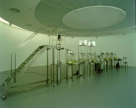
Another friend sent me to look over this installation in order to flush out my artistic preconceptions. Such work should make all of us feel better the next time someone tells us our art looks like...well...like...

Cloaca (2000) by Wim Delvoye
[Photograph by Dirk Pauwels]

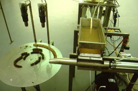
Cloaca (Detail)
[Photograph by Cristoph Neerman]
Artnet, in a post titled "A Human Masterpiece" by Els Fiers, fills in the gaps:
Cloaca, the latest work by the Belgian conceptualist Wim Delvoye (b. 1965), has just closed out its run at the Museum of Contemporary Art (MuHKA) in Antwerp. It was a room-sized installation of six glass containers connected to each other with wires, tubes and pumps. Every day, the machine received a certain amount of food.
Meat, fish, vegetables and pastries passed through a giant blender, were mixed with water, and poured into jars filled with acids and enzyme liquids. There they got the same treatment as the human stomach would supply. Electronic and mechanical units controlled the process, and after almost two days the food came out of a filtering unit as something close to genuine, human shit.
During the exhibition, the smelly assembly line caused quite some consternation. It seemed to bring an infernal message into the world. There is enough dung as it is. Why make more?
Worse, the installation was placed in a cold, clean space at the museum, where it was nourished by a first class chef who prepared two meals a day in an attached kitchen. The atmosphere suggested a hospital equipped for a strange experiment -- the birth and care of a machine that eats and defecates -- a mechanical baby. "Hi," it seemed to say, "I'm almost like you."
[...]
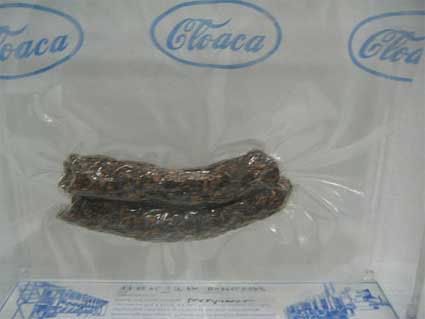
Delvoye has given a name to his harsh creature: Cloaca, referring to the ancient sewer in Rome. But while the cloaca maxima proved to be useful, this Cloaca goes beyond every purpose, except of course revealing of the meaning of art. So, too, the spending and earning of money is part of its purpose. The machine daily delivered turds that were signed and sold for $1,000 each.
Delvoye has since gone on to make new improved iterations of defecating machines. Version 8.0, Super Cloaca, consumes 300kg of food and produces 80kg of waste daily.
And you say you're having trouble selling fractal prints? Perhaps the problem with your art is that it's just not as tactile as Delvoye's:

Delvoye also set himself the task to insert the products of Cloaca in the global economic system. The Casino Luxembourg had a special Wim shop where you could buy a Wim action figure but also a whole range of Cloaca products: Cloaca T-shirts, a 3D Viewmaster, Cloaca toilet paper, posters, etc. But that's just a merchandising detail: the Cloaca machines are works of art which produce works of art. On show were dozens of vacuum-packed Cloaca eliminations made during the 5 first exhibits of the machine around the world. There's apparently a waiting list of collectors eager to buy one of those, and the faeces made during the New York exhibition are the most sought-after.
--from "Wim Delvoye: Cloaca 2000-2007" on We Make Money Not Art
This project takes the museum guide's admonishment of please don't touch the art to a new level.
In fact, metaphors expand almost exponentially here. Is this elevating the low or undercutting the high? Is the message that all modern and postmodern art is crap (literally!!) or is this analysis from absolutearts.com more in line with your thinking:
Cloaca brings together trends in contemporary art that are usually considered separately. At one extreme is a growing interest in how art and technology intersect, particularly with regard to where life begins and ends, and the impact of artificial intelligence, robotics, software, and bioengineering on cultural production. At the opposite end of the critical spectrum is the investigation of abjection as a fundamental part of the human condition. Cloaca addresses both of these areas of inquiry by drawing direct parallels between the contemplation of art, the contemplation of our body and its functions, and the degree to which each are effected by advances in medicine, gene mapping, and technology. In its imitation of human behavior, Cloaca even functions as a modern-day golem.
Maybe, in the (ahem) end, we should let the artist have the last word
When I was going to art school, all my family said I was wasting my time, and now I have made a work of art about waste.
~/~
Go for the Jugular (2008)
And speaking of art stuff that stinks...
Tim's latest post on Anti-Fractals was definitely on target. A noticeable trend among some of the more prominent (through their own self-promotion) Ultra Fractal artists is to produce fractals that don't look like fractals. In fact, these fractals (and Tim provided examples) seem to want to mirror conventional art -- especially abstract expressionism resembling melted ice cream.
As Tim notes, UF's upgrades have been deliberately designed to remove fractalness by adding Photoshop Jr. graphic manipulation tools. Now Xtreme layering and masking can be done in a "pure" fractal generator without suffering the heartbreak and guilt of "cheating" with Photoshop. Working in UF strictly in order to make large prints is a defensive rationale I often hear. But anyone with weightlifting processors and plenty of RAM oomph can post-process on a grand scale fairly easily in Photoshop. No, the real reason is probably an ailment found in royal blood -- closer to a kind of disinterested, entitled snobbery.
Don't get me wrong. I'm happy to see fractal art look less stereotypically identifiable as such. I've been hitched to that wagon for many years.
But how ironic is it that some of these fractalists freely exploring the increasingly non-fractal, non-representational modern art event horizons are the very people who will insist other feudal fractal artists remain confined within safe, conventional, same-as-it-ever-was boundaries.
Let's revisit the rules for acceptable entries in last year's Benoit Mandelbrot Fractal Art Contest:
We want to show artwork that is uniquely fractal; artwork that uses fractal tools to produce less-fractal imagery is not as desirable.
Why do I keep expecting to read some huckstering small print ad speak like:
Using Ultra Fractal not included. Limitations not applicable to contest panel members.
Look at the images Tim included in his post. No, the rules did not apply to BMFAC's judges. They were free to be as progressively avant-garde as they wished. That way they can come off looking more cutting edge -- more convention-smashing than the regular entrants they conveniently artistically hogtied.
And if you want to join the vanguard of these pioneers, you best follow their lead and imitate their style. Better yet, just clone their representations by enrolling in the Mississippi School of Anti-Fractal Art™.
But don't expect apologies anytime soon from this bunch who profit out the eating end by self-selecting their own work and then profit again out the defecating end by hanging that same non-juried work into a juried exhibition they themselves have judged.
Do you smell something?
I do. Every one of the BMFAC judges should be ashamed.
But they aren't. At all. On the contrary, they're getting big time promotional exposure as heavily trafficked blogs like Boing Boing send websurfers scurrying to gawk at the contest pages.
This is mixed blessing, of course. The true exhibitors and winners -- those who actually had to enter the competition, who played fair by the hypocritical rules limitations the judges imposed but were not bound by, and who were juried and selected -- deserve every recognition. I hope the BMFAC site is swamped with people coming to see the real winners. This achievement spotlighting their talents should be widely seen.
But it's a travesty that the judges who set up this promotional self-glorification to further their own careers are also openly reaping rewards. BMFAC is a rich "field of dreams" for them. Apparently, if you build an arrogant publicity stunt, they (sadly) will come.
Fractal artists everywhere should be outraged at such transparent ploys.
Instead, though, a few supporters of the BMFAC judges continue flamethrowing me emails insisting I apologize for pointing out our fractal emperors have no clothes.
~/~
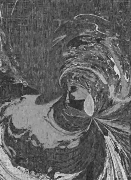
Image made with Fractal ViZion. Post-processed until even vampires wouldn't come near it.
Rooms with a View
Blog with a View
Tags: fractal, fractal art, digital art, computer art, ron eglash, vim delvoye, cloaca, benoit mandelbrot fractal art contest, art contests, ultra fractal, mississippi school of anti fractal art, orbit trap


