Saturday, March 28, 2009

R.I.P. -- Benoit Mandelbrot Fractal Art Contest?
And, no, my gun is not shaped like a minibrot.

And how long would you say have these alleged fractals been missing?

[Image seen on self-delighting soul]


I stumbled into a bit of a mystery this afternoon. What happened to the fractals displayed on the Benoit Mandelbrot Fractal Art Contest websites?

Not only the fractals but everything else is MIA: winners, also rans, losers, judges, intractable sponsors, lists of rules, photos of the directors hanging with Mandelbrot, everything. All gone. Sites for both the BMFAC 2006 and BMFAC 2007 contests have gone dark.

What went down? Anyone in our newly established non-existent community know the scoop?

Here are some off-the-cuff possibilities followed by snappy rejoinders to each:

Possibilities:

a) The sites are temporarily down for maintenance.

b) The sites are being moved to a new location.

c) The known-to-be-insistent sponsors severed funding and insisted the sites be shuttered.

d) The bandwidth expenses for hosting the nearly 50 honorably mentioned images from the 2007 contest became too much to fiscally handle.

e) The BMFAC judges finally became so shamed from participating in such a blatant venture of crass self-promotion that they revolted, hacked the sites, and brought them down.

f) Although the contests had no entry fee, submissions to the Mississippi School of Anti-Fractal Art have fallen off so much that self-publicity from the BMFAC was no longer "profitable" enough for a few of the judges/teachers to use the buzz to fill classes, and thus the contest sites collapsed in upon themselves like a spent black hole.

g) God actually does exist, noticed the gross travesty of BMFAC, and smote their web presence.

h) Pressure and negative criticism from a certain unmentioned blog eventually forced the BMFAC to go gently into that good night.

Rejoinders:

a) Possibly, although the rest of Fractalus (BMFAC's former server) seems to be humming along just fine.

b) Maybe, but wouldn't the previous sites have a message indicating a move is in progress or has been made rather than showing surfers blankness?

c) Doubtful. The BMFAC sponsors were always shadowy straw men. They were vilified as being responsible for the contest rules that let the judges into the show through the back door as a "hedge against insufficient quality," but the 2007 rules (same as the 2006 rules) were announced long before any sponsors were named.

d) Could be. Having 50 rather than the more traditional 5 honorable mentions certainly ups the page hits. But since both the 2006 and 2007 contest sites hosted the images of all entries, this supposition is unlikely.

e) Yeah. Right. (Rolls eyes). When recursive pigs iterate.

f) Well, six courses in "Fractals and Flames" are still listed and apparently going strong, although one of the BMFAC judges is no longer currently listed among "the faculty."

g) Be nice to think so, but I suspect God has bigger fish to fry -- like whipping up plagues of locusts for former Bush Administration war criminals.

h) Chances are slim. According to defenders of the unethical practices of the status quo and a few roving trolls, no one actually reads or (shudder!) would ever take this certain unmentioned blog seriously.

Tags: , , , , , , , , ,

Sunday, March 22, 2009

Is Ultra Fractal Really a Fractal Program or Is It a Bold New Spaceship By Which To Explore the Algorithmic Heavens?

Consider this:

And about these continuous and pointless attacks against Ultra Fractal, maybe you should just start displaying some fractal images that obviously cannot be realized in Ultra Fractal. I haven't seen any on your blog so far. The ease with which it is possible to implement ideas into algorithms and then works (especially with the new object oriented programming) makes it for me without any doubt the best tool available for algorithmic art. Anyway, a constructive approach would be less boring for your readers.

That was a comment by Samuel Monnier, an unrepentant Ultra Fractal user, commenting on a recent posting here at Orbit Trap.  In keeping with the Space exploration analogy which I used in the title, Sam has the "Right Stuff", the thing which Tom Wolfe said separated the mediocre astronauts from the ones selected by NASA to go on the elite space missions to the Moon.

What I think Sam is getting at (besides suggesting that Ultra Fractal is being attacked pointlessly) is that he has found Ultra Fractal to be a tool which allows him to easily create Original Algorithmic Art.  Sam (and a few others) are using Ultra Fractal to do extremely un-fractal things.  Isn't that exciting?

More from Monnier:

I've been using Ultra Fractal for about ten years. I'm mainly interested in producing images which display structure at every scale, everywhere, unlike most more traditional fractal images, which display structures at small scale only in some very limited regions. The goal is that the viewer should be able to enjoy the work when looking at it from far as well as when looking at it with a magnifying glass. To this end I developed a private algorithm, taking advantage of Ultra Fractal's versatile formula editor.
(from http://www.ultrafractal.com/showcase.html)

"A Private Algorithm."  This sounds exciting.  Actually, anything with the term, Algorithm, in it sounds exciting; Fractal is starting to get a little too small-townish for me, lately.  Private Algorithm sounds more experimental, cutting edge and next-generational.  Like carrying out atomic bomb tests in your basement.

Monnier continues:

The algorithm I wrote is inspired by the one used to produce Brownian clouds. The idea is to draw a pattern, and then sum it at smaller and smaller scales. This gives the image structure on a wide scale range while preserving some kind of homogeneity, as the patterns you will see with your magnifying glass will be roughly the same as the ones you see from far. Each image is a whole little world that is rather difficult to imagine from the low resolution pictures displayed here.

The possibility to use classes in algorithms introduced recently with Ultra Fractal 5 allowed [me] to substantially increase the diversity of patterns this algorithm can create.
(from http://www.ultrafractal.com/showcase.html)

"The idea is to..."  Sounds rather creative and speculative, doesn't it?  Not the usual Mandelbrot this, or Julia that or tweak-fest tricks.  Could this sort of thing explain why Sam's artwork is so different than the usual Ultra Fractal trash that fills up that annual garbage can of fractal "art" called the Fractal Universe Calendar?

Enough words and talking, let's look at some art:


20080720 by Samuel Monnier, from the Ultra Fractal Showcase
Click for larger view

Strangely, this is one of my all time favorite images, I cannot exactly say why. It is based on a Truchet pattern. The Truchet pattern is constructed from randomly oriented decorated square tiles. In this image, their orientations were chosen not quite randomly in order to create this strange alphabet. Note the symmetries of the "text" between the dark and light regions, and how the fine texture reproduces it.
(from http://www.ultrafractal.com/showcase/samuel/20080720.html)

"...to create this strange alphabet"  Hey, far out.  You really have to take a look at the larger image to see what Sam's talking about.  Which brings me to the question, What is Sam talking about?

It ain't no fractal.  Or maybe it is -- mathematically speaking.  I guess what I mean is that this isn't the sort of image one expects to see from a fractal program.  This is the sort of thing I would expect to see from a non-fractal algorithmic art program or coming from a series of photoshop filter mutations.

I think it's important to note that Sam says it's one of his all-time favorite images.  Why is it one of his all-time favorites?  I know why.  Because it's from a distant star and not just the same old sort of thing that we commonly see down here in the everyday fractal world -- that place we've come to call home after all these years.

It's time to head to the stars, boys and girls!  Fractals are great but there's a great big universe of algorithms out there to be explored.  Maybe Ultra Fractal is the ship to take us there.  Maybe it's time to stop using layers to make wispy, flowery stuff to fill that annual eyesore and start making bold new structures like Sam.

I used to say that the best way to tell if a program was any good or not was by looking at what was made with it.  That's why I made those "pointless" attacks on Ultra Fractal, because every time I found some glossy, cliche fractal image on the internet it almost always turned out to have been made in Ultra Fractal.  That's also why the work of Samuel Monnier and Paul DeCelle stood out in such stark contrast -- they they're work is creative, original, algorithmic art.

In my personal artistic opinion I think the programming capabilities that Ultra Fractal has that allow it to make these sorts of "non-fractal" images is something that should be pursued more; it's more high-class than the traditional fractal stuff.  The fractal image layering and image importing features have very limited artistic potential (unless you like that sort of thing, of course) when compared to using Ultra Fractal as a programming platform for algorithmic experimentation.

Of course embarking on these sorts of algorithmic voyages requires the programming and theoretical skills (math) which the average Ultra Fractal user doesn't have, but I'm sure when new users see more of this type of artwork it will generate a lot more interest in learning how to write formulas for Ultra Fractal to the point where such specialized skills become a routine part of the creative algorithmic art process.

Yes, some day Space Travel will be common place and perhaps Ultra Fractal will change it's name to Ultra Math or Ultra Formula or 2001: An Algorithmic Odyssey.

Sunday, March 15, 2009

200 Weeks of the Fractal Window Weekly at Renderosity

Scratch by Simon Kane

Scratch by Simon Kane (SimonKane)


I've moaned plenty in the past about the fractal art areas of virtual art communities like Renderosity and deviantART. Sometimes, in such places, observing and discussing art becomes tangled with mutual admiration and friend-gathering. That's why OT has christened such online haunts as Fractalbook.

But when these communities make efforts that live up to their mission, such actions should be noted, just as the creative efforts of individual artists and editors should be commended.

Recently, the Fractal Forum at Renderosity put together a retrospective of 200 Weeks of the Fractal Window Weekly. Whatever your fractal art tastes, I urge you drop by (or register to do so since some links in Renderosity open only for users who are registered as members). It's always insightful to get an overview of work that's been shown at an established "gallery" over a period of years. Personally, I enjoy examining pieces of widely differing élan, so I figured why not post a few that I especially enjoyed. I agree with Tim who said in a recent post that "fractal art is evolving into a number of unrelated styles." Such forking of the paths can sometimes be seen in this collection.

Before beginning, though, I see that the FWW editors, Barbara Din (DreamWarrior) and Vivian Wood (Tresamie), took some thread flak for their choices. I hope they won't take the criticism too much to heart. The act of presenting such a retrospective should probably provoke some worthwhile public discussions. But I'm glad the editors took the risk and made the effort. I notice some evolving styles on display but find no prevailing bias.

The image above by Simon Kane may be my favorite of the collection. Line, form, and motion collide here with a force that startles and causes the viewer to second guess depth perception.

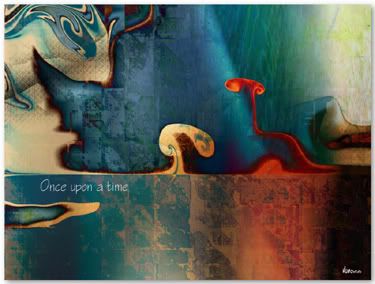
Once Upon a Time by Elizabeth Mansco

Once Upon a Time by Elizabeth Mansco (mansco)

Elizabeth Mansco has a painter's sensibilities and is sometimes drawn to narrative suggestion -- traits, not surprisingly, I find attractive. The fluid forms, waves of light, and washes of colors are very sensual here. And the embedded texture of shadowy Sierpenski triangles is striking.

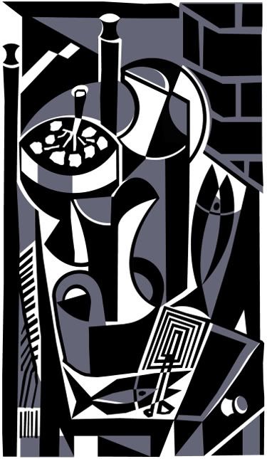
Poissons by Paul DeCelle

Poissons by Paul DeCelle (PaulDeCelle)

I enjoyed these UF takes on the work of Lars-Gunnar Nordström by Paul DeCelle so much that I've written previously about them -- twice. They were, arguably, the most interesting fractal art series I saw last year.

The first three images I've selected were made using Ultra Fractal. Contrary to rumor, I don't detest the program. But its best practitioners do reveal a certain refined UF style and one much different from the more conventional aesthetics of the Fractal Universe Calendar.

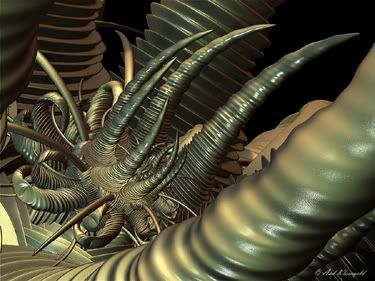
Reaching Out by Aad Kleingeld

Reaching Out by Aad Kleingeld (kleinhoon)

Whoa. It's Tetsuo -- The Radiator Hose. You don't need those leftover 3-D glasses from watching Coraline to feel the disjunction and perceptual pull from Aad Kleingeld's gnarly XenoDream creation.

Find Them in Hidden Places by jennyfnf

Find Them in Hidden Places by jennyfnf

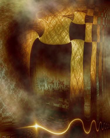
The careful construction of this processed Fractal Explorer image by jennyfnf caught my attention. Harsher geometric forms brush against bursts of line light and play off mysterious smoke forms and cascading, patterned edifices. The overall effect is strangely dreamy.

There's much more to see and explore while poking around in this retrospective. If the less socially stunted or more outright paranoid among you choose to scroll down to brave the comments, well, just remember what I said earlier about not taking whatever gets said to heart.

Tags: , , , , , , , , , , , , , , ,

Tuesday, March 10, 2009

Image of the Week: Harmonics by "O"

What?  By who?

Why I call myself O. Most people think of Chaos as the opposite of Order, but actually Order is merely Chaos constrained. In this respect, Order and Chaos form a continuum that comprises the fullness of existence. The opposite of this "fullness" is the "nothingness" or a Void, often represented by an empty circle.

(from More About O)


Freaky, eh? There's more:

As O, I play Yin to Chaos' Yang in bringing forth images that display the fullness of Chaos.

All these images were created with a freeware fractal program called Fractint, using only its standard built-in formulae. In keeping with the spirit of its developers, I have not encrypted these images or tried to make them "proprietary" in any way so that others may learn and improve upon the techniques I have used.

(from More About O)


I have a sneaking suspicion who this artist is, but I'm not making any guesses right away.  Let's just look at the art. (Click images for larger view)


Harmon01 by "O"


Harmon201b, by "O"


Harmon231, by "O"


Harmon04, by "O"


These images may not be the kind that get people excited over at Renderosity or Deviant Art these days, but I think they're good fractal art nonetheless.  I suppose most people have moved on from Fractint but have they all moved up to making better fractal art?  The creative power of fractal math, even in an old-fashioned program like Fractint using 256-color palettes, can be more impressive than an image made with a newer program utilizing all sorts of graphical effects but which displays little algorithmic character.

These images really need to be viewed at their larger size to fully appreciate the detail that I find makes them so interesting.  Although they are patterns and completely determined by a formula, they possess an important quality of good design --unpredictability-- which is exhibited by the lack of repetition and the high degree of variation that one sees when they're given a more careful look.

The third one, Harmon231, has a very rich, almost painted style to it that is surprising in something made with such a simple, 256-color palette.  The image reminds me of the painted ornamentation in ancient Egyptian tombs.

In the first and last, Harmon01 and Harmon04, the large Celtic-like rope work displays what looks like symbols at the main intersection points as if the formula was labeling itself with it's own custom algorithmic hieroglyphics.

The second, purple one, Harmon201b, is perhaps the most interesting of the group because of it's most pronounced design element, the empty, colorless holes with irregular shapes.  Some of the line details are a single palette color and don't even appear to be anti-aliased and yet complement the rest of the work which resembles a cross between thermal photography and avante garde painting.  All that from using an old dinosaur of a program like Fractint!

Well, that's the way it is with Fractal Art, or I guess any kind of art: it's not so much what tools you use as how you use them.  Some people might view this artwork by "O" as being very simple and maybe even primitive, but the artistic effect obtained with them rivals anything created with more complex programs.  And it's all about making art, isn't it?

Tuesday, March 03, 2009

Fractal Guernica


Fractal Guernica, by Pablo Picasso II
(guernica03.loo)


In the same category as room-temperature fusion, perpetual motion and the age-old alchemical quest to turn lead into gold, is added yet another bold and fearful challenge: to make a piece of fractal artwork that rivals the depth of expression of Picasso's famous painting, Guernica. I threw down this challenge recently albeit in a very off-handed way, via a blog posting and near the end of it, suggesting it was merely something mythical and hypothetical which would be good for one to contemplate and aim at, even if it was out of human reach.

Well, wonder of wonders, here it is -- all algorithm and all art.  You could call it an accident, I suppose, but that's the whole point of the hitherto mythical Fractal Guernica concept: algorithms don't express anything other than algorithms.  If algorithmic art is just an accident then fractal art is all about chasing ambulances and spotting crash scenes.

For those of you who like big art, or are just getting old and need to see everything large, here's a large version.

Anyhow, let's get the discussion of rich, visual symbolism started, the kind which only a really great work of art can provoke.  Hopefully we'll be able to decode everything the artist is trying to say, because these things can be pretty complex and convoluted.  And that's without even attempting to psychoanalyze the artist or take a Marxist perspective.

What's it all about?  Hey, slow down.  How about, what's that bull with the half-moon head all about?   That's what I saw first too (foreground, left).  Did the artist rip that right off Picasso or what?  Actually, we ought to get something straight, right off the bat: the artist is the algorithm.  What does an algorithm know about that?

The bull is actually a cow (unimportant) and is an allusion to the cow jumped over the moon nursery rhyme.  But the moon has now obscured the cow's head and left it confused and blind.  This is a direct reference to the space race and how it got bogged down once it actually landed on the moon subsequently losing it's direction and which since then has literally gone nowhere.  The strength of the space age has become deluded by it's own achievements.  The big green thing beside it comes later.

Background, left (top,left) is one of the most shocking off all images.  It represents aircraft and perhaps bears some similarity to the original Guernica.  The airplane has a huge mouth and is attempting to consume the Earth (the blue round thing).  While in most of the world aircraft represent modern, advanced transportation, in other parts of the world aircraft are entirely different and play the role of the most voracious of all war machines.  Don't think Boeing 747 Jumbo Jet; think Mig-29 or F-18.  If you've ever seen, and particularly heard, a modern fighter jet maneuvering in the sky above you, the deep rumble, the sound of the sky ripping apart and your chest reverberating, ear drums rattling -- then this image is easily understood.  The aircraft is depicted not as a gleaming white bird, but like a crocodile, an ancient lizard with a long, teeth-lined snout, pursuing the Earth itself.  Snake of the sky, King of the Air.

Bottom, right.  It is modern man himself (herself).  Notice how long the arms are; very long, they're extended.  Technology has extended the arms of modern man but at the same time weighed them down and reduced their choices.  The golden glow (a recurrent theme, representing technological enlightenment) distorts his face and his head is turned at an angle which is out of sync with the things around him.  There's more, but it's obvious.

Middle, right, above modern man.  The volcano has a strange eruption on top of it because it's not a volcanic eruption at all -- it's an allusion to the Biblical tower of Babel on top of a natural tower, a volcano.  The tall structure is a broadcast antenna.  Broadcasting what?  Babel sounds.  The communication that links and informs so many all over the world is ultimately a source of confusion and something which discourages people from cooperating: propaganda; biased news reporting; stock manipulation, liar-mercials.  Well, it's a small part of the total work, so let's not dwell on it.

Above the moon which is on top of the cow's head is a series of legged creatures enveloped in a golden glow (remember the golden glow?).  Bonus marks to the art history students who guessed, Bruegel's Blind Leading the Blind.  Except in this case it's the technologically enlightened who are blindly stumbling, one after the other.

Finally, the main element in this work, the golden glob of stuff dropping down (mid-picture) colliding with the green glob rising up.  The golden glob is filled with things coming down from above -- space industry spin-offs -- biotechnology, genetic engineering, creatures dark and intriguing.  The golden glob is the descending technological world which should be ascending, but has reversed direction and now comes into sharp conflict with the green movement of environmental responsibility and technological restraint.  (Notice the purity and simplicity of the green glob as contrasted with the complexity of the golden one, although there is something like a red scorpion with his tail sticking out, in the green glob.)

On the large scale, note how the elements are at the same time detached from each other and yet in collision with each other.  It suggests that their movements or trajectories are conflicting but not intentionally conflicting.  Instead, the collisions come from the expression of their nature and not any sort of conscious will -- a sort of Babel like manifestation of decay through mental confusion rather than through conflicting or competing desires.  Everything just falls apart because it no longer has any connection.  The modern world is freedoms in collision.

Stepping back even further, there is some irony here that a work that depicts technology as some horrible thing destroying people and their relationships was in fact made using a fractal generator, one of the most technological of all things I would say.  In fact, I'm going to go out on a limb here and say that this artist is in fact a hypocrite; demonizing technology and yet at the same time using it to to make art just for fun.  Is he blinded by that golden glow too?

Whoa.  Far out.  That is so 21st Century.