Monday, October 26, 2009

Keith Mackay's Revisionist History
Do as I say, not as I do...

"It was already dead, so I didn't see any point in keeping it around."


One of the few extant group blogs on fractal art got its plug pulled recently. This was no surprise since the wedream(ed)incolor blog, run by Keith Mackay, had been on life support for some time. In fact, Tim wrote an OT post about its terminal condition not long before Mackay decided to play Dr. Kevorkian with it. In an October 10th post on his personal blog, Mackay explains why he finally swung the axe. And, naturally, he goes out of his way to sketch out why his actions were far more preferable than the "unethical" steps taken by an unnamed blog that can only be Orbit Trap:

I deleted everything on wedreamincolor because I felt that it was the right thing to do. A few years ago I was part of a fractal based community blog that fell apart when the blog owners started to personally attack some of the other members. The owners cut off write and edit access to the 20 or so members but hung on to all of the images and entries that the members had made. I thought that it was terribly unfair and unethical for the blog owners to do that. With all of their contributions, the cut off members provided significant readership and momentum to that blog. It would be akin to a place like DeviantArt removing write and edit access to their members, but hanging on to all of their images and journal entries. That would piss off a lot of people. It certainly pissed me off when that blog did that to me, so I decided to not do that to the contributors of wedreamincolor.

Mackay, as usual, is not telling you the whole story. It has always been Orbit Trap's policy to remove any post should a contributor request we do so. Mackay knows this to be true from first-hand experience. He wrote us to insist his OT posts be removed, and Tim and I promptly deleted them. To date, Mackay is the only former contributor to make such a request. I'll say again, just so there is no misunderstanding: If you are a former Orbit Trap contributor, and you want any of your posts removed from this blog, email OT's editors, and we will quickly see that your wish comes true. However, you should be aware of the following implications: 1) Deletion of posts cannot be undone. You want it gone? It's gone for good. 2) Deletion of a post also deletes all comments for that post. I'm not sure how those good folks who took the time to comment on your writing will feel about wiping them out of existence. Still, OT feels it's your post, and thus your call. 3) If your post is a response to other posts, then the context or reference point(s) your post provides will be kaput. You may be giving rhetorical ground and creating a vacuum in argumentation where your point of view once provided a counter balance to the views of others. And 4) Visitors peruse OT's archives every day. If you don't want ongoing attention to your images and writing, just let us know.

So, given our policy, why does Mackay feel he is morally justified to criticize us about keeping posts online? Did he go out of his way to ask his blog's contributors if they wanted their posts (and the effort that went into making them) taken down? Remember, too, such excision means all the post's comments are expunged as well. Didn't his contributors (and commenters) have the presumption when posting that their work would remain online? Why should Mackay's contributors suffer because he goes into a melancholy funk and decides to scorch earth his blog? Really, though, this is typical, impulsive, slash and burn behavior from Mackay. How many times has he capriciously trashed then rebuilt his various Fractalbook galleries? I've lost count.

And he claims the happy family, kumbaya, group blog days is when OT had momentum? Somebody hasn't been reviewing OT's stats to properly keep score. Feed subscriptions and readership has increased at least tenfold since OT scrapped its initial group blog format. Mackay has everything backwards. OT did not succeed because we initially had so many "great" fractal artists on board; we succeeded in spite of that fact. The growth in OT's readership took place after we junked what Tim likes to call the "community limbo" phase of OT. I suppose Mackay can be forgiven for assuming that gathering together a collection of so-called "prestigious" fractal artists would be the best way to get the community interested in our blog. Tim and I thought so, too -- at first. It wasn't until we changed the blog's format that we discovered that OT's readers wanted something else -- something they weren't getting from their Fractalbook forums and UF List threads. That is: honest, opinionated criticism. They didn't want another venue where artists went on talking about themselves. They'd had enough of the mutual admiration society where every post elicits the compulsory "Another Masterpiece," suck-up, bargaining chip, you-scratch-my-back remark that must be repaid in kind somewhere down the comment chain. Instead, readers want a direct, critical perspective -- something the fractal community never engages in. Even if OT's readers did not always agree with us, they at least appreciated our plainspoken bluntness. For example, if we feel a fractal contest is crooked, we say so -- and we do our best to outline and illustrate the facts and behaviors that lead us to formulate such an opinion.

But Mackay would have you believe we have been unethical for not following his model example -- an example that collapsed into epic fail mode. What Mackay doesn't want to face is that his warm fuzzy group blog couldn't generate much interest outside its own narcissistic, insular crowd. Like the small pond insiders on the UF List. Like the back-slapping shut-ins inhabiting Fractalbook arenas. Like the cowards who falsely flatter others to ingratiate themselves and worm their way into the good graces of any fractal artist presumably having status and power. Ironically, Mackay's blog had some of the very same contributors who once cranked out a few-and-far-between post on OT during its salad days. So I have to ask. Why is he now chiding us for not following the very same framework that resulted in his blog's slow death?

Then again, I'm not all that surprised that Mackay shredded every post from wedream(ed)in color. After all, that's what's done when you don't want anyone to see the record of what you've actually done

***

UPDATE: Keith Mackay has responded to this post here by reanimating a few limbs of his dead (now undead?) group blog apparently for the sole purpose of answering OT and notes that

No one should ever answer to [Orbit Trap] for anything.

which, paradoxically, does seem more than a little like answering to us for something.

~/~

Tags: , , , , , , , , , ,

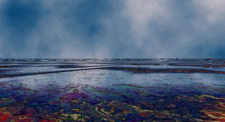
Sailing into the Horror

The Garbage Path by Guido Cavalcante

The Garbage Path by Guido Cavalcante

[Click on the image above to see a large-scale version.]


Editor's Note:
This is a guest posting by Guido Cavalcante. His image was made using Ultra Fractal. Excerpts in this post were taken from "Our Oceans Are Turning into Plastic...Are We?" by Susan Casey. For more information about the Great Pacific Garbage Patch, please see this post at RTSea blog. The current print edition of Rolling Stone also has an excellent article on the floating plastic mass: "The Great Pacific Garbage Patch" by Kitt Couchette. To illustrate the severity of plastic debris polluting the world's oceans and waterways, Couchette notes: "On British coastlines in the North Sea, a study of fulmars found that 95 per cent of the seabirds had plastic in their stomachs, with an average of 44 pieces per bird. A proportional amount in a human being would weigh nearly five pounds."

Orbit Trap welcomes guest posts on fractal art topics. Query the editors using the email link in the sidebar.

~/~

The facts happened twelve years ago.

It was August 3, 1997. A sunny day with little wind, Captain Charles Moore and the crew of Alguita, his 50-foot aluminum-hulled catamaran, sliced through the sea.

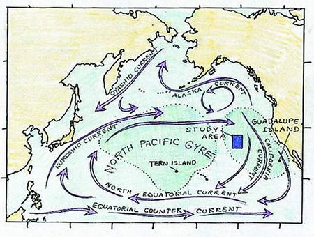
Returning to Southern California from Hawaii after a sailing race, Moore had altered Alguita’s course through the eastern corner of a 10-million-square-mile oval known as the North Pacific subtropical gyre. This was an odd stretch of ocean, a place most boats purposely avoided. So did the ocean’s top predators: the tuna, sharks, and other large fish that required livelier waters, flush with prey. The gyre was more like a desert -- a slow, deep, clockwise-swirling vortex of air and water caused by a mountain of high-pressure air that lingered above it.

Map of the Gyre

Map of the gyre. The blue square represents one study of the garbage patch.

[Click on the image above to see a large-scale version.]


The area’s reputation didn’t deter Moore. He had spent countless hours in the ocean, fascinated by its vast trove of secrets and terrors. But he had never seen anything nearly as chilling as what lay ahead of him in the gyre.

It began with a line of plastic bags ghosting the surface, followed by an ugly tangle of junk: nets and ropes and bottles, motor-oil jugs and cracked bath toys, a mangled tarp. Tires. A traffic cone. Moore could not believe his eyes. Out here in this desolate place, the water was a stew of plastic crap. It was as though someone had taken the pristine seascape of his youth and swapped it for a landfill.

How did all the plastic end up here? As the Alguita glided through the area that scientists now refer to as the “Eastern Garbage Patch,” Moore realized that the trail of plastic went on for hundreds of miles. Depressed and stunned, he sailed for a week through bobbing, toxic debris trapped in a purgatory of circling currents. To his horror, he had stumbled across the 21st-century Leviathan. It had no head, no tail. Just an endless body.

The memory excerpts above of the first encounter with the Garbage Patch remain one of the most terrible discoveries of the century. My image tries to represent the surprise of the horror. I think it is the first time the Patch has been graphically represented, except for photos. For those that want to read the six page description which leads me into the adventure of making an image tied with the reality, it is here:

--Guido Cavalcante

~/~

Tags: , , , , , , , , ,

Monday, October 19, 2009

Force 10 from Navarone!

In keeping with the Phase 2 idea that the essence of fractal art is found in the imagery and not in the tools that made it, I present a mixed bag of things I found while taking the paths less traveled, or never traveled, to find fractal art.  I followed a number of categories during my search on Flickr, mainly the New Abstract Vision Group.  Ironically, I found this a better path to take than the more orthodox and straight forward strategy of simply searching on the word, "Fractal".  I think they're all interesting; whether they're all fractal is a matter of argument and I present them here as food for thought.  None of them would look out of place in any fractal art gallery, that is, with the exception of the tree stump, which at first might be considered a joke, but only once one recognizes that the outer edges of this apparently inverted formula are covered --in bark.

(Click on the images or text links to see larger views and links to similar work by the artists on Flickr.)


Untitled by Segozyme, 2009

Just a spiral, but how many fractal images can we list that serve no other purpose than to be such simple laboratory specimens upon which experiments in rich, ornate rendering textures and colors are conducted?  It's all in the surface texture which in places resembles the pitted surface of the moon and in others resembles expensive suede leather.  I've always thought that spirals were the still lifes of fractal art and this one's a fine example.


Aztec by Manas Dichow, 2008

Manas Dichow is a fractal artist I've reviewed before.  He uses Ultra Fractal, and I think it was from a comment to this image in his Flickr gallery that I got started on the New Abstract Vision Group's Flickr gallery.  I found this image to be a good example of the complex juxtaposition found in fragmented images of micro/macro and detail/panorama and if it caught the eye of a member of that Flickr group then I thought I ought to see what else they've collected.  Of course, from a fractal perspective this image is just a sierpinski triangle variation with simple coloring and not the sort of thing you'd expect much from.  But Manas, like most good fractal artists, seems to excel at the use of simple formulas to make surprisingly interesting and artistically engaging work.  Very creative.


101100111 by jj1236
Although it's really not all that apparent, this image is a painting.  At first I wasn't sure as I've seen a lot of sophisticated rendering that creates paintbrush textures like this.  As far as it's fractal qualities go, doesn't it have the proliferating, vegetative look that many fractal programs easily produce?  If I had to guess the rendering, I'd probably say it was a Stalk method.  But it's a painting and if you're interested you ought to check out similar ones in jj1236's gallery.


P by -P-, 2007
Nice title eh?  I'd go even further in the alliterative exercise on the letter P and point out the Purple.  Another spiral, but what a strangely proportioned one and with such neonic (neon like) coloring.  I think there's a Party going on down there.  I don't know why I like this one so much.  I think it's the Paul Klee-like shape and style to the spiral and also the fact that it's quite tastefully presented and not over-layered and stuffed full of distracting elements --simple and strong.  Who would dare to make such a simple and bold spiral?  -P- would.  He even made it his avatar.  That's Perfect!


treestump C905 by Ian's Art, 2009
Well, I tipped you off to this one in the intro so you knew it was a tree stump.  The title's not too subtle, either.  I just find that the shape, the patterns in it, and the je ne sais quoi of fractal art is evident.  Apparently Ian thought it was a work of art too, so there's another vote.  Does this mean the lumberjack who cut down the tree was a fractal artist?  I can just see the lumberjacks discussing technical matters during a smoke break, "Sven, I'm tired of cutting on the usual plane.  I'd like to experiment with 1/mu today."


Untitled by Segozyme, 2009
Hmmn... I suspect that Segozyme might have used this same spiral formula up top there in the first image.  This one was either layered in order to incorporate the background, or some filtering took place to produce that orange powdered texture on the iron spiral.  A lot of attention in the fractal world is paid to such details as surface texture and it's also quite common to compose the background from completely unrelated imagery.  Why not do both?  We often work hard to get a realistic, photographic appearance in digital work.  Why not just import everything?  If you want to end with photo-realism, why not start with photo-realism?  That's a guaranteed method.  Nice work, Segozyme.


Untitled by Phantom Blot, 2009
Funny, you'd expect a two-headed mandelbrot to look both ways before crossing the road, but this one didn't.  If you had to guess how this image was made, what would you say?  I've seen fractal art like this.  Actually, this is an even better example.  One of the unofficial jobs of artists is to challenge our comfortable ideas about art by putting a frame around ordinary objects or objects that we would normally disqualify from the category called art.  Only then can we be tricked into seeing the beauty of that foreign object which the artist, being more observant than the average viewer, has already detected.  We often see what we expect to see.  The human mind just works that way.  I think this is a photograph of an old plaster wall.  But that could be a trick.


Solder by Howard J Duncan, 2009

When you suspect everything of being frameless art then you have learned something, I think.  We praise avante garde artists because they have shown us new kinds of art; they have shown us something which was always there, but we just couldn't see it before because either we've never looked in that sort of place before or we didn't expect it and our eyes just glided over that sort of thing.  When they put a frame around it, it helps us to focus our attention and see in a gallery what they were able to see --in the wild.  I like this one because it's impossible to tell whether it's a deliberate creation or something resulting from the accidental and random effect of natural decay.  One's mind becomes a hung jury wanting to both release the defendant and restore them to a place of dignity and honor, and yet, at the same time to see them capitally punished to such a degree that time itself will be reversed and their evil deed erased from very soil of the Earth.  I'll let you cast the deciding vote.


Tidal by Howard J Duncan, 2009

Perhaps you are thinking that I have become a big fan of (my goodness, this artist has a real name!) ...of Howard Duncan?  Actually, I just looked at the artwork and bookmarked what l thought was interesting as I surfed the Flickr galleries.  I was quite surprised when I wrote all this up and discovered that three of the ten were by the same artist.  It ought to happen more often, but it doesn't seem to; I find many fractal artists have one or two interesting works and about a hundred that are, to put it nicely, "in progress".  Rich surface texturing and a strange flow of --solid-- shapes  makes for a dynamic sort of abstract image that changes its shape the more you look at it.  I wonder if that was intentional?


Bias by Howard J Duncan, 2009

This has got to be a fractal.  That is, the kind made in a fractal program.  I've never seen these thread-like intersections in any other kind of imagery.  But, honestly, I'm guessing because as you can see for yourself by clicking the link, there's no information in Howard's Flickr gallery to indicate how, or with what, it was made.  Even the image tags only list Digital, abstract, bias and hypothetical.  Hypothetical is an interesting term for fractal art.  This image as anyone can see, is quite simple.  In fact it's really made up of a tiny and probably minor rendering detail of a much larger fractal image, but shows how one can sometimes be creative with even those sorts of things.  Interestingly, this obviously fractal image is probably the least fractal of all the ones I've presented here, in my mind.  One could easily draw such things in a paint program and the grainy background is most likely a simple graphical (noise) effect.  Fractal art is much easier to define and describe when you focus on the finished artwork and not the tools.

Well, I hope you've been as challenged by these fractals ("genuine artificial" or otherwise) as I've been.  Removing the software bias from the definition of fractal art I think will make the genre both more meaningful as well as more creative.  At the very least, it will force people to look at fractal art more closely.  And that's always a good thing when it comes to art.


Technorati Tags:

Wednesday, October 14, 2009

Dan Wills: Fractal Columbus


halleyDetailTwoPointNine... by Dan Wills, 2008
-Click for larger view-

Like a needle in a haystack, or a glowing needle in a fractal formula, is the rumor of a continent over the horizon or the possibility of some new and intriguing fractal artwork out there, somewhere, on the internet.  My impression after browsing over Dan Wills' Picasa web gallery is that he's someone who excels in searching out new kinds of fractal imagery.

All done in Ultra Fractal, Dan's artwork stands out from the usual UF type of artwork in it's pure fractal simplicity.  This is fractal art in it's most authentic and engaging presentation --snapshots from a New World.


butterflyPhoenixDoubleNova... by Dan Wills, 2008
-Click for larger view-

This second image I chose for it's naturalistic look and for the subtle, but impressive coloring.  You can really see here the wide variety of fractal forms and seemingly endless unique details to be explored.  I don't know why more UF artists don't produce work like Dan has done here.  Maybe they need a Columbus to tell them it's there first?  Well, let's continue our voyage...

The next image I found to be really something worth writing home about.  It's from his superpositions collection (the first one was from the ultraEpsilon, and the second from the butterflyLaces).  The hazy appearance to all the images like this one add a realistic touch, and in a 3D sort of way.  The Julia things look like they've been frozen into the larger fractal shapes.  It's an interesting mix of what you'd expect to be very standard, even dull, fractal themes but yet the result is a new hybrid thing --a super positioning, as the gallery title suggests.


butterflyPhoenixDoubleNova... by Dan Wills, 2007
-Click for larger view-

Is work like this too simple to be worth drawing people's attention to?  Or, rather, is it too fractal for most people in the fractal world today?  We can add photo-imagery and luscious, de-luxious, rendering layers and create ever grander and more lavish recipes, but none of that beats plain old, hard-core, fundamentalist fractal imagery.  Why work like this has sat in obscurity like it has is yet another testimony to how new and still growing the fractal art form is.


butterflyPhoenixDoubleNova... by Dan Wills, 2008
-Click for larger view-

This one ought to be enough to start a whole new legend of El Dorado.  They're out there.  Maybe you can track down Dan and beg him to give you a copy of his treasure map, that coveted parameter file, that made this image.  Nice coloring.  Subtle, but attractive and still natural looking.  Another good example of the complexity of "ordinary" fractal art.

I expect to see more work like this, simple and powerful --spawn of the math-machine-- fractal wonders.  And it won't be because it's promoted or given Olympic gold medals.  More will be created because there's plenty more New Worlds out there beyond the horizon and artists like Dan Wills and others will gladly go there, even in obscurity, and bring back snapshots to the Old World because it's just a natural thing for them to do --explore.  Fractal art is like that.

Technorati Tags:

Thursday, October 08, 2009

Meanwhile, back at the Academy...


lesson_2_atmosphere_isolation_for_janet
Click to Enlarge
I found this in the Student Galleries section of the Visual Arts Academy.  There's no name or date but it's filed in the Ultra Fractal Artistry section of the gallery, a course given by Janet Parke.

I like this.  In fact, I fished it out of all the student works there as the one that appealed to me the most.  However, I should mention that most or all of the works there are probably produced for specific course assignments and to demonstrate competency of the course material, so it's not the standard sort of online gallery.

This is a fine example of a number of things.  For one it shows how the complex graphical features of UF can be used to compose interesting artwork that would be eye-catching in any venue, fractal or non-fractal, or even online or off.  The image is really indistinguishable from any abstracted landscape painting found in a traditional gallery.  Although details often change when viewing digital artwork at differing levels of resolution and size and also when produced as prints, what I can see in this image is a darkened, moonlit, landscape barren of features and yet very expressive in a surrealist way.

If the purpose of this course was to teach artistry, then I'd say the student has learned something or at least polished whatever they already had.  But perhaps teaching artistry in the context of a program like UF which has so many user-controlled graphical functions is much easier and also much more necessary as its features allow the user to work with fractals the way one would work with photos in Photoshop.  UF is a program designed to give artists creative control of imagery; to paint with fractals in the sense, as I mentioned, artists work on photographic imagery in Photoshop.

UF is a program that enables a wide range of conventional digital artistry.  It's natural then to teach a course on how to use those conventional layering and masking features in the context of fractal generated imagery just like the example I've selected here.  I'm quite curious to see what sort of influence these online courses at VAA have on the development of fractal art.  I really think that regardless of the instructor's personal artistic preferences and whether they fit with the student's own, one can only hope to gain something of value from instruction even if it's only a better technical use of their tools.

Back in High School art class, our art teacher's taste in art seemed to focus on gardens and other forms of colorful foliage.  Not the sort of thing that appeals to iconoclastic teenagers, but we learned a lot about composition, design, color, and the importance of developing a personal style.  The teacher never expected anyone to imitate what she did, and I don't think any of us angry young artists did, although some of us did gain a greater respect for the fabric, wax and dye medium called Batik.  Man, she made one almost three stories tall!

Are there some similarities in this student work to Janet Parke's own style?  I suppose, in a general way, perhaps the color scheme and flowing, folded shape of the structures in the image, although these are becoming fairly common choices in UF work these days.  But there's a harsher grittiness to the student's image and a significantly more saturated, less muted tone to the colors that makes for a very different mood.  I'd say the style is quite different, although, like I said, such details can be distorted by changes in image size and as we all know, in UF, image size can be pretty big.  It's quite possible that the image we're looking at is a mere thumbnail of what the instructor and the student were viewing for the purposes of their coursework.


By Helmut Tarnick, XenoDream Introduction Course
Click to Enlarge

People often go nuts with XenoDream and try to concoct all sorts of creative, but confusing images.  And they're almost always made of brightly shining gold or silver that looks just too clean and shiny to be real, not to mention it's use, in flowing liquid form, spashing about in impossible ways.  So what I like about this one by Helmut Tarnick for Joseph Presley's XenoDream course is the relatively simple yet appealing shape he's used and the tasteful and realistic steel surface he's given it that allows me to study the image without having to put on sunglasses.

Interestingly, the larger image you'll see on the Student Gallery page by clicking on the image or caption, looks less photographic than this smaller version I've used here.  Realistic surface texture is easier to do in lower resolutions obviously.  But I'd check out such technical things with Professor Presley before you go saying that on the final exam.  Why should the iteration of such a simple piece of metal look so appealing?  It's a fractal thing, I guess.  The self-similarity and ever expanding number of pieces at lower scales just naturally captures our attention when done tastefully like this.  Also, there are simple, but intriguing patterns to be seen if you study the image carefully to find the juxtaposition of the same element repeated at differing scales --a basic fractal characteristic.  Overall; a very skillful and artistic use of XenoDream's capabilities.  Maybe Helmut will be teaching his own course one of these days?

That's it for my perusal of the Student Galleries at the Visual Arts Academy.  You might want to consider taking a course there someday.  Or perhaps you might want to consider teaching one yourself; their home page says they're looking for qualified instructors.  Think of all the talented students you might end up teaching.

Friday, October 02, 2009

Sheets in the Wind and Rings of Gold: The Ultra Fractal Style

Whether you're a fractal artist or simply just a fan of fractal art, you're bound to eventually notice similarities in style and develop preferences for this kind of art or that kind of art. Fractal art is still what I would consider to be something of a niche art form, but thanks to the internet, enough of it has been created and displayed that one can start to see styles emerging.

The most obvious style to anyone observing fractal art today is what I would call the Ultra Fractal Style. It's more than simply art that is made with the popular program Ultra Fractal now in it's fifth version; the UF Style focuses on the enhancement of basic fractal imagery by constructing, through the use of graphical layering, images with very elaborate structure and detailed surface texture. The UF style has pioneered a movement away from simple fractal forms in favor of images that rival the most complex creations of popular graphics programs like Photoshop.

While most fractal enthusiasts have eagerly adopted this style and some have even categorized their artwork as Before Ultra Fractal and After Ultra Fractal, I see this style as more of an abandonment of fractals as an art form than an enhancement of it. While not all artists utilizing the powerful programming and layering features of UF produce work that would fall into the category, UF Style, most artists using the program lean heavily on the program's graphical rendering powers and make little effort to explore the fractal side of the art form.

Two recent fractal artworks, both of them winners in the BMFAC of recent years, exemplify what I would describe as the UF Style. The first is by Dave Makin, entitled Theme Park 2 and was a winner in last year's contest. The second by Nada Kringels, And how is your husband Mrs. Escher, a winner in the 2006 contest.


Sheets in the Wind


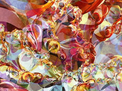
Rings of Gold


I've labeled them Sheets in the Wind and Rings of Gold because those are the best descriptions I can think of to summarize the kind of imagery that characterizes the UF Style and these two images are some of the finest examples of it in addition to being familiar to many people in the fractal art world because of their presence in past BMFAC exhibits. These two images have met with critical success and therefore represent not only the artist's own preferences in fractal art, but the confirmation of those preferences in the larger fractal art world itself by their selection in the contest.

I think if one reflects, even just a little, on what they see displayed on the internet as fractal art, they will see that most of it falls into this UF Style category and the epitome of it is work, like this, that features not fractal forms but rather the slick rendering powers of this cutting edge graphical program. It's not the fault of the program, and similar results can be achieved with other fractal programs or with other software combinations, it's just that most fractal artists today have fractal art all backwards.

Their approach is backwards; rather than first seeking out an interesting fractal form and enhancing it graphically, they start with some mediocre fractal form, or several, and then try to make it interesting by, literally, layering it with gold or tweaking the colors to produce some attractive piece of fluttering fabric. I see this in both these images. Rings of Gold at least exhibits some recursive pattern, although the pattern, without the gold, is not significantly interesting. Sheets in the Wind is, at best, a borderline fractal image and would only suggest a fractal origin if viewed in another context, such as, a collection of Photoshop artworks, because the image is abstract and reasonably complex enough that it would have required some sort of computational help, a fractal program perhaps? Why either of these images were chosen to be part of an exhibition to introduce people to fractal art says something about today's fractal art world and it's own view of itself.

It's cliche. I don't just mean that it's popular. Although popularity can create cliches, cliches arise because of a lack of new, innovative ideas. Those new, innovative ideas can also in turn become cliche, but only if the art form loses it's creative force and stops developing. (And what would that look like?)

Dave and Nada are making artwork that I believe they truly enjoy and as I've suggested, their winning spots in the BMFAC shows that they are not alone in pursuing this UF Style of work. The judges, as shown by their selection of Dave and Nada's work consider it to be exceptional and worthy of distinction in their contest. So my real criticism of the UF Style is not with any of the artist's that make it --that's their personal preference in art. My real criticism of the UF Style is how it's come to be critically accepted. First off, it's only weakly fractal; and secondly, it's visual attraction is almost entirely based on slick looking computer imagery effects which, honestly, might have excited an audience back in the early 90s, but which now are found in almost every television show or advertisement. If they think this sort of thing will wow the average person on the street who they're trying to introduce to fractal art, they're mistaken.

Fractals have a lot of artistic potential and a kind of imagery that easily captivates most people regardless of whether they understand the mathematics behind them or not. But the UF Style of artwork resembling Sheets in the Wind and Rings of Gold isn't like that at all. It's cliche and it's hung on this long because nowadays most fractal artists prefer to tweak mediocre work to perfection rather than experiment with fractals. If they want to make that sort of thing, that's fine, it's their artistic choice, but giving it awards and presenting it as the best in fractal art just makes us all look stupid.

Technorati Tags: