To Frame or Not to Frame ...
It seems that the more talented the artist, the smaller the frame. Seriously. It seems that many of us go through a phase where we think "if we frame it, its art" followed by some truly amazing (and often ugly) frames. Then, as we get better at the art part, the frames diminish until we dispense with them altogether.
My three main problems with framing fractals are as follows:
- The frame can detract from the fractal
- Fractals made into "prints" are often framed after they are printed, so and "electronic" frame would need to be cropped anyway
- Framed stuff is useless as desktop wallpaper
Of course, there will always be the exception that proves the rule :)
Bad Frame (it makes me cringe, even now)
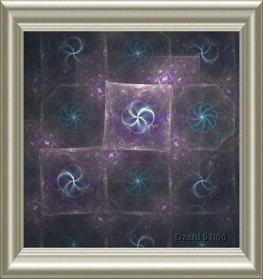
"Medium Frame" (aka how to destroy good artwork)

Very Small Frame
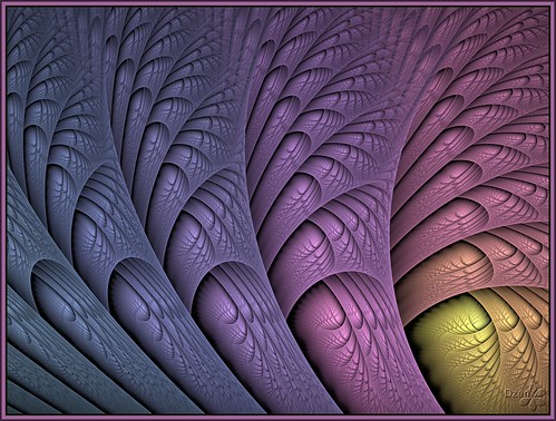
Prepared to admit this is one of mine
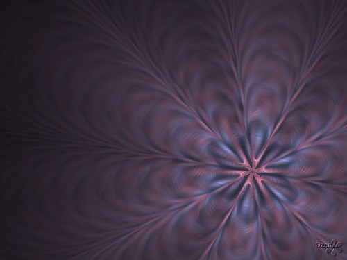
The Exception (hopefully)
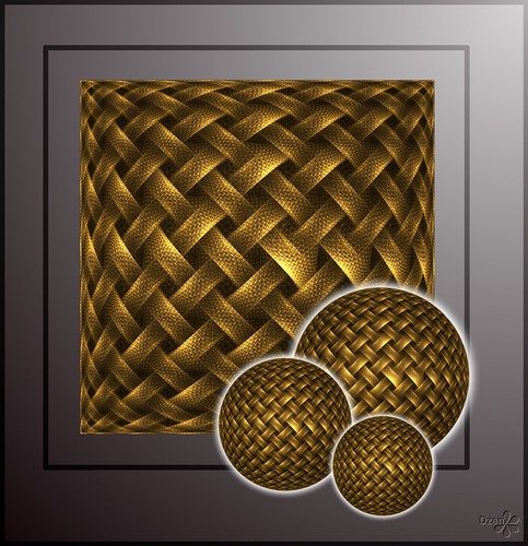


7 Comments:
Excellent article. Love the "exception" btw. I've tried framing in the past, only to ruin the picture. :( Truly fractals are better unframed.
5/05/2007 7:11 PM
Thanks for the feedback. Its good to know that I've talked about something that is relevant, and hopefully useful.
5/05/2007 11:27 PM
I like what you said and how you gave exemples. I have another proposal: "how to sign digital images?" I myself don´t like signing as you did - on the image. Why digital artists insist on printing the signature instead to sign at the external area of the image as is the use for engravings for instance? And by hand, with the indication of how many copies are going to be printed from the original? Ex.: 3/50 - meaning the third copy from a edition of 50. I think that would bring some aditional value for collectors.
ps. I know that printing the name on the image sometimes is a question of protection against images´s robbery.
5/06/2007 2:04 PM
An excellent point Guido. I sign my digital images with a digital signature (watermark) if I am putting them on a sight like flickr. This is so that if people use my art, then at least my name is on it.
When I print images (eg on cards), then the front does not carry the signature. At the back of the card, a smaller version of the image (with a clear signature) appears. I also put the name of the piece on. Card buyers really seem to like this feature.
If you were printing / selling the work, then a hand done signature would be more appropriate than a digital one.
At the end of the day, its up to the artist to decide what they want. It would be a good idea to talk to potential buyers as well and get their views :)
5/07/2007 12:21 AM
Well, this is an interesting topic.
I do see a lot of people adding frames to their fractal images, but to be fair, it's not just restricted to fractals. I've seen it with other digital art as well.
I never really went for frames directly within the image because I got started doing fractals early on with the intention of making prints. That same philosophy steers me clear of certain algorithms and programs, too, since creating print-size imagery from them is hard, but that's another topic. But if you're going to print, including a frame right in the image seems... odd. And, from having framed many pieces, I know that sometimes you want different frames for different settings.
Guido, you asked why people sign inside the image. Lots of artists (not just digital artists) sign inside the image itself. I've almost always embedded a title and copyright notice inside my images, the latter as a reminder to the free-wheeling internet hordes that the work isn't entirely unrestricted. When I print images, I use a much smaller (relatively) and fainter watermark, and the signature is done by hand in an inconspicuous place.
5/07/2007 4:47 PM
Not that I desagree on signing on the image. I recgnize that most artists (and not only digital artists) do it often. I was trying to call attention to the detail thinking on how a watermark can sometimes damage the image if it becomes dominant. Since I believe digital art is closer to the arts of engraving (lithograpy for instance)and photography - since they deal with reproductivity - I try to put a remark on some forms of signing that make it more valuable for collectors.
But le me say another thing: I really like very much the first work you show, on purple color, with a repetition of the graphic elements. The repeated forms on the same surface are producing something "cinematic" for the vision. It is one of the things I found most attractives on modern art. And your work produces an impression that you´re thinking and (re)-thinking the same problem on its multiples sides as of you are doing an interrogation at each graphic element. Very good!
5/08/2007 11:08 AM
I, too, used to play with fancy framing, but I have gradually toned it down so that now I use either a simple beveled edge (I keep this as a preset layer in UF) or a simple internal bar frame, very thin. When I print, I render the image without the frame layer. When I am posting online, I render with the frame so that my image feels more 'finished'.
5/25/2007 3:43 PM
Post a Comment
<< Home