In Pursuit of Ugly Fractals
One trap which a lot of fractal images fall into is that of being merely beautiful: the only aesthetic response I can muster is "oh, that's pretty". Ultimately unrelieved beauty just gets boring - like a vapid supermodel with nothing to say. If I never see another lovingly-layered spiral in a tasteful, smooth color scheme, I'll die a happy man.
There are of course special difficulties attendant on fractal art which tend to lead to this state of affairs. Fractal art is not representational, and a fractal is not a picture of anything - it might look a bit like a bird or a flower, but it isn't, so the avenue through which emotional resonance from the real world might enter is well-nigh closed. This makes it more difficult for an image to be 'more than beautiful'. It is also absurdly easy to make a fairly beautiful fractal, which debases the entire enterprise.
So in sheer desperation I would like to see some ugly fractals. Not the godawful hippy-psychedelic-cannabis-poster kind of ugly; but an interesting, different kind of ugly.
This is the ugliest one I've made myself: 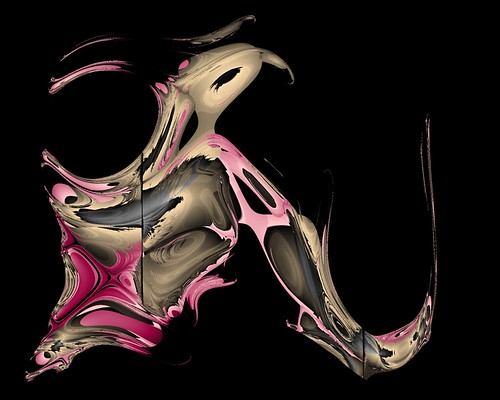
Please add some links to your favorite ugly fractals in the comments - I'd love to see them.
posted by Albert Smooks at 2:40 AM
![]()
![]()


12 Comments:
psychedelic and cannabis in the same phrase? and what's the allure of an ugly image (fractal or not)?
i suppose you can get an infinite supply of ugly fractal images by taking a good one and messing up the colours?
*totally confused*
7/21/2007 3:20 AM
oh, and i have to agree with something you said, at least partially:
"It is also absurdly easy to make a fairly beautiful fractal, which debases the entire enterprise."
that's true if you're using someone else's software, and/or postprocessing.
what i did here is impose some handicaps: write your own software, no postprocessing allowed!
especially when one makes the transition to 3d this becomes quite an engrossing challange, and i find one gets a greater appreciation for the beautiful mathematics involved in creating fractals along the way -- and end in itself!
7/21/2007 3:24 AM
Many people are attracted to fractal art because of its fractal nature, funnily enough. Their fascination with it stems from the repetitive, recursive patterns. This is what they like to create, this is what they like to view. You might as well start railing against watercolourists for producing art which looks like it was made with watercolours, or complaining about the number of watercolour paintings of flowers.
The one thing which strikes me about much (not all, but much) of the type of finished product you seem to be so keen to see, is that it has no "fractal recognition" factor and could have been created using other means, including traditional. That, of course, would necessitate the artist having the skills to produce these by other means.
Then again, maybe you're just manipulating a big stick? Your photo stream consists almost entirely of "traditonal" and recognisable fractal art.
And as all the clues lead me to the inescapable conclusion that you are the progammer behind Gnofract ("Gnofract 4D is a free, open source program which allows anyone to create beautiful images called fractals.") I do find it somewhat amusing, not to say ironic, that the program's website uses the adjective "beautiful" so often ;-)
7/21/2007 9:00 AM
thomas - I mean those horrible posters marketed at stoners, typically with a big rainbow-colored cannabis leaf in the middle and a bunch of fractals in the back.
welshwench - yes, I wrote Gnofract 4D, and made those 'traditional' fractal images with it. I advertise it as creating beautiful images because that's what most people want to do with it. I'm not really satisfied with any of my output - unfortunately I'm a better programmer than I am an artist.
Ideally I would like to see things which are recognizably fractal or mathematical in nature, but which are less conventionally pretty and have more of an edge to them. I don't believe that fractals have to look the way they usually look in order to be fractals.
7/21/2007 3:42 PM
i think you'll find that the rainbow colours are more directed at the lsd/"magic mushroom" crowd - attracting stoners is completely different and much easier, just have some pictures of muffins and doritos.
but i digress, i had a look at gnofract and it looks pretty cool :D especially the way you did the compiler (linking to gcc output), very crafty! what i fail to understand, still, is also what welshwench was talking about: why the interest in ugly images? (esp., as she notes, considering you use the word beautiful so much ;)
7/21/2007 7:05 PM
The author of Gnofract?
I'm sorry, Edwin, I didn't realize you were the author of Gnofract when you joined Orbit Trap. It's great to have an accomplished programmer like yourself contributing to the blog.
I've tried Gnofract out a few times myself and I really like how it makes such smooth gradients and incorporates formulas from UF and Fractint. It's really great to see some new fractal programming going on, especially for Linux too (I use Kubuntu).
7/21/2007 7:46 PM
Here's an ugly fractal made with Gnofract 4D.
You won't see any of my fractals starring in shampoo commercials... or sitting on the hoods of cars...
7/21/2007 8:28 PM
i was pretty happy to see the NON-palette based colouring in the features list! elsewhere on this blog i said something about palette-based colouring being to noticably 1 dimensional, and it's just great to see some of the non-proprietary fractal apps recognise this :)
back on topic, i'd say the only "purposely ugly" fractal i've ever made is this one: http://www.deviantart.com/deviation/38642123/
its excuse for existing is that it's the culmination of some "canvasing" experiments i was doing with my latest ifs program. a much more appreciable example of the technique can also be found in my deviantart scraps: http://www.deviantart.com/deviation/38640049/
7/21/2007 9:38 PM
i suppose you can get an infinite supply of ugly fractal images by taking a good one and messing up the colours?
I agree.
All my fractal images are ugly. If they aren't then the reason is that
the "choose random gradient" worked
or I used some wonderful gradient provided by others that would made
a nice image out of any garbage.
But here I would like to speak about another kind of ugliness
that you find in creating fractal.
You get some embarassing images
that look like porn images
or anatomic samples details.
The images usually are for me too
ugly or embarassing to publish but I will give here two examples that present only slitghly this kind of ugliness:
the rose and
Inside the shell
7/22/2007 8:20 AM
On August 30, 2006, I did publish here a text tittled like "Fractals that no One Wants to See". Not pretending to be self referenced I think some concepts there could be useful for the understanding on the meaning of beauty and non-beauty on modern artworks. The idea of ugliness was adopted by modern art since when Claude Monet´s "Le Déjeneur sur l'herbe" shocked the bourgeoise of that time - the painting was considered merely horrible. When Marcel Duchamp dubbing a urinal "art" and naming it Fountain (1917), the concept of ugliness as a component associated with art was finnally incorporated on artistic objects. We must be glad that fractal artists finnally are understanding that beauty is not a maximum goal of creaction for any artistic medium. Be ugly to be good :-)
7/22/2007 4:20 PM
If art mirrors life, and fractals are art, then fractals can be used to show “ugliness” as found in life. This can certainly be the case, as both Guido and I have argued on this blog, when fractals are used as activist art -- as in this example.
Giuseppe is also right that fractals can sometimes cause suggestive anthropomorphic surprises that some people might find distasteful. This particular rodent somehow become more endowed than Dirk Diggler in Boogie Nights.
7/22/2007 11:10 PM
Terry,
"touro of duty" is a great work - and I love the reference to Picasso´s Guernica! Another example of ugliness of artworks. Am I right saying that?
7/26/2007 8:30 AM
Post a Comment
<< Home