Omission
The early 20th century ballet impresario, Serge Diaghilev, wrote "Omission is the essence of art."
In the second of my courses on using Ultra Fractal at the Visual Arts Academy, I teach many techniques for using mask layers to judiciously add elements to or remove them from an image. I use masking extensively in my work, as described in a previous Orbit Trap post, because it allows me to introduce subtleties of shading and texture into an image.
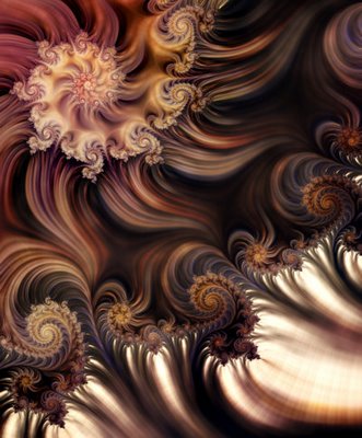
To demonstrate what I mean, I'll use a recent work that ended up totaling 10 host and 13 mask layers. First, here are just the 10 merged host layers, without any of their accompanying masks:

This image has interesting variation in color, and a good deal of contrast between dark and light areas created by the coloring formula; the textures I've used appear equally in every part of the image, but the overall effect is still quite flat. My eye doesn't really know where to look because there's so much going on and each area of the image has the same impact – not unlike a middle school band in which each of the participants is playing the right notes, but all at the same a-little-too-loud volume.
Now here's the finished image – exactly the same 10 layers, in the same order with the same merge modes, but now with their respective mask layers attached:
I've used the mask layers to take away elements of the image – texture, color, structure – in order to create the illusion of depth and shading. They create areas of interest that attract the viewer's focus and areas of stillness that allow the eye to rest. The areas of dark next to light don't just provide contrast in tone, they create a sense of depth and dimensionality that was missing above.
I realize that my stylistic preferences are not shared by everyone. That's ok. But I also wonder what folks might discover in their fractals if they thought about subtracting rather than adding elements.


2 Comments:
A nice post. I agree that often less is more.
When I revise writing, I almost always cut material rather than add.
Subtracting can be an effective way to shape composition, to better highlight forms, and to sharpen perspective.
12/22/2006 12:44 PM
A funny thing happened... I browsed quickly the post and enjoyed the first image a lot. Automatically, before I saw the author, I tried to guess who it could be from the image. I'd have bet on Damiens Jones or maybe Paul DeCelle. Then I saw the author was Janet and felt something was unusual with the style... Then I actually read the post and understood. :-)
Great images, but I must say I prefer the first image to the second. But it's probably just my weird taste for strongly colored and textured images... :-P
12/30/2006 6:35 PM
Post a Comment
<< Home