Tuesday, March 27, 2007
Sunday, March 25, 2007
I am become Klimt!

When Robert Oppenheimer witnessed the first nuclear explosion, a project which he personally managed, he apparently said, "I am become Death, the destoyer of worlds".
When I first tried out this photoshop filter, I said, along the same lines, "I am become Klimt". I didn't say it out loud, just like Oppenheimer, I suppose, didn't declare out loud that he'd become Death.

plain mosaic squares overlayed 50%
A mosiac filter is part of almost every graphics program. Sometimes it's called "pixilate" or something like that, since a mosaic is essentially the rendering of an image in larger, simpler pieces (ie. lower resolution) resembling pixel blocks.
It's probably an easy thing to program, like blur or sharpen. But this particular mosaic creates a variety of effects derived from that simple idea of the mosaic. Instead of just a square, you can have a box with a little square inside. The box and the square are different colors, based on the underlying image and some simple complementary or other color wheel relationship. The mosaic square can also be circle or ball (solid circle) or gear or flower. They save very well as indexed pngs since they're already indexed to a certain extent, as long as you don't include a gradient effect.

Layering too. Or blending, they call it. This creates some very interesting effects because you can make a "semi" mosaic image by overlaying the effect by degrees. Some look like squares of transparent tape stuck to the image. I like to use Square Rings or Gears, Cell pixel size= 10, Blend= 130 (half way), Normal/Overlay/Multiply/or Expose, and no gradient things.

It's called, the Mosaic Toolkit made by Lance Otis, and is free. It ought to be called, Klimt in a Can. The webpage has a sample mosaic of George Washington, which can be viewed from 30 feet away for an interesting digital parlour trick. I have to admit, that image caught my eye and I might not have downloaded the filter if I hadn't seen that because there's a lot of free photoshop filters around and most of them are not too exciting. Some parts of our minds are pretty simple.

Mosaic Toolkit is in the "creative" category, meaning it "makes" things, and you don't really know what the image is going to look like until you try it. Although the results from "creative" filters can be disappointing when used with "good" starter images, they can also be very exciting and produce something great from a "plain" starter image. I think the most important characteristic of a starter image is its color scheme, since that's usually the only trait that will survive the transformational process (unless you use layering/blending).
It's so simple.
Tim Hodkinson
Technorati Tags:klimt, gustav klimt, fractal art, digital art, photoshop filters, mosaic toolkit, lance otis
Friday, March 23, 2007
Ways of Seeing -- Part One
After all, every picture is a history of love and hate
when read from the appropriate angle.
--Leopoldo Salas-Nicanor, Espejo de las artes, 1731
I've been spending time lately with an interesting book -- drinking in one chapter at a time some nights just before turning in for sleep.
Reading Pictures by Alberto Manguel explores the various ways human beings "read" images and breaks the viewing process ("seeing") into a series of imaginative permutations. Although I wonder if these categories could be applied to most if not all visual imagery, Manguel limits his analysis to the fine arts -- specifically painting, photography, sculpture, and architecture.
I'm not saying I agree with Manguel's subdivisions, nor do I mean to suggest that alternative ways of reading/seeing images are not possible. I am interested, however, in trying to determine if Manguel's rubric can be applied to fractal art -- which, naturally, I consider a bona fide fine art.
I've chosen my own work to illustrate this first post -- because, well, I'm most familiar with it -- but, if I continue to post on Manguel's categorizations, I'll mix in work by other fractal artists as well.
Here, then, according to Manguel, are the first two options for seeing and reading (and thus interpreting?) any image.
~/~
The Image as Story
Every good story is of course both a picture and an idea, and the more they are interfused the better the problem is solved.
--Henry James, Guy de Maupassant
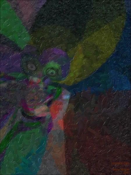
Flower Girl (2007)
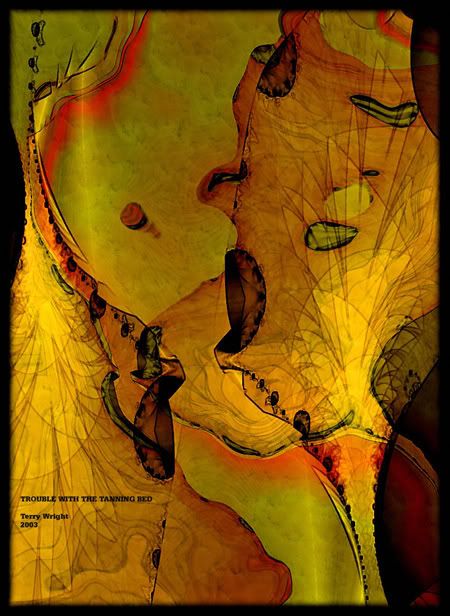
Trouble with the Tanning Bed (2003)
Images are most frequently seen placed within a narrative framework. Not surprisingly, many viewers are driven to "make sense" of what they see -- even if the image is highly abstract. The question then isn't what is it? -- but what's happening here? The answer often comes in the form of a story provided by the viewer -- created out of individual experience or pieced together in the imagination. By casting images into narratives, people make pictures meaningful. Fractal artists who make more "representational" art might have an edge here. Manguel notes such story conversion is the most frequent method for "reading" images, and he describes such interpreters as "common viewers." The example Manguel uses to illustrate this method is Van Gogh's Shipping Boats on the Beach at Saintes-Maries.
Perhaps this is part of the reason why some viewers strongly dislike modern art. The abstractions "don't look like anything." There's no nature to mirror and -- critical to Manguel -- no story to spin.
But wait. Whose story is being told? The artist's? Or, more likely, the viewer's? After all, it is he or she who fills in the plot's missing gaps and supplies the rising and falling action?
And, more disconcerting, can we trust the artist to truthfully tell "a story"? We know novelists sometimes revert to unreliable narrators (like Huck Finn). Film, too, can cause us to distrust the storyteller -- as in The Usual Suspects and Memento. How can we be sure the artist is not just messing with us, stringing us along, even mocking us? I'm reminded of Hamlet teasing foolish Polonius over the shape of a cloud:
Hamlet: Do you see yonder cloud that is almost in the shape of a camel?
Polonius: By th' Mass, and 'tis like a camel indeed.
Hamlet: Me thinks it's like a weasel.
Polonius: It is backed like a weasel.
Hamlet: Or like a whale.
Polonius: Very like a whale.
--Shakespeare, Hamlet, Act 3, Scene 2
Of course, Polonius thinks Hamlet is mad. But what is our excuse if an artist decides we need to be put in our places with ironic jokes at our own expense?
Even if an artist is straightforward, can we always believe our eyes and be certain our concocted stories are not self-deception? Are we seeing only the shadows on the wall of Plato's cave? Can we "mis-read" an image? And why, even when we've studied the same work, are our separate narratives often so noticeably different? Consider this exchange from Woody Allen's Manhattan when Isaac and Tracy run into Yale and Mary at the Museum of Modern Art:
Mary: Really, you liked the plexiglass, huh?
Isaac: You didn't like the plexiglass sculpture either?
Mary: Uh, that's interesting. No, er, ...
Isaac: It was a hell of a lot better than that steel cube. Did you see the steel cube?
Mary: Now that was brilliant to me, absolutely brilliant.
Isaac: The steel cube was brilliant?
Mary: Yes. To me, it was very textural, you know what I mean? It was perfectly integrated, and it had a marvelous kind of negative capability.
Apparently, not all our stories get straight -- however much we (artists? viewers?) try.
Manguel notes that "storytelling exists in time, pictures in space." A text is not contained within the boundaries of book covers. We can cite individual lines of Emily Dickinson and summarize whole novels in a paragraph. Here's Kafka's The Metamorphosis in one sentence: "A man turns into a bug and his family and his boss get pissed." But, in contrast, an image is perceived instantaneously and is confined within the parameters of its frame.
What is "the story" of the flower girl in the image above? Is the scene a wedding or a rehearsal or merely playacting? What is her mood? Scared? Nervous? Bored? Or is it inscrutable? Why the big eyes? Where's the background? Do I see wings? Are the flowers still fresh? Hey. Choose Your Own Adventure.
And what exactly is the trouble with the tanning bed? Did it malfunction turning someone inside out resulting in mass melanoma (and giving new meaning to someone being "toast"). Could it be (cue sinister Cold War music) sabotage??? Or is the image a projection of the future? A suggestion of exaggerated things to come? Or just the horrific sunburn of the living dead?
You tell me. You're the one "reading" it. What's your story?
~/~
The Image as Absence
To restore silence is the role of objects.
--Samuel Beckett, Molloy
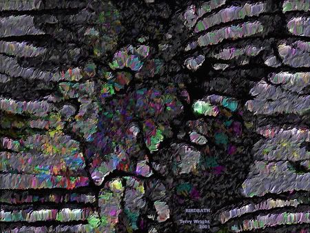
Birdbath (2001)
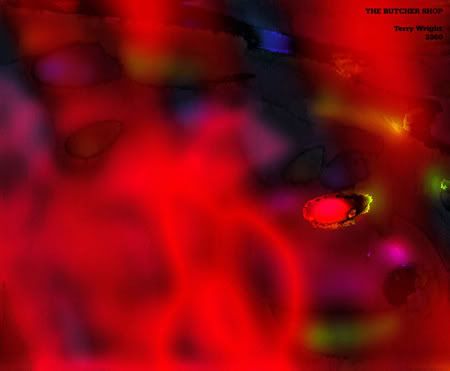
The Butcher Shop (2000)
Sometimes what is unseen is what one is supposed to see. The convenient linearity of the well-made play doesn't apply here. What is missing is what is meaningful.
Life's most intense emotional events -- like death or divorce -- can often be shown better by what is absent: the empty chair at the table, the indentation on one side of the bed, the closet filled with unworn clothes.
How does one see the unseen? Is some art so...I'm searching for the right word here...so...confused...that the very imposition of making a reading undercuts what one is trying to comprehend?
Manguel gives the example of writer Severo Sarduy who wrote about a traveling film projectionist who tried to show a documentary on new agricultural techniques in a remote village in Cuba. The villagers had never seen a film before, and they sat politely on rows of wooden benches and quietly watched the swirling light. Apparently, they recognized a chicken when it suddenly appeared in the lower left corner of the screen -- but comprehended little else. They had no way to "read" a film -- to decipher its codes of quick cuts and tracking shots. Sarduy sensed the villagers saw the film as a jumble of shadows and light. In short, it was a mess.
Some people had a similar response to the paintings of Jackson Pollock. Just drips. What a mess. I could do that. But at the very moment when the culture was moving away from digesting words (radio) and racing to a constant stream of imagery (TV), Pollock produced paintings that shunned any attempt at narration -- either in words or through pictures -- and seemed to disdain all control for either the artist or the viewer. Manguel claims that Pollock's work "seemed to exist in a constant present, as if the explosion of paint on the canvas were always at the point of occurring" (Manguel 24). Maybe that's why one critic complained that Pollock's paintings had no beginning or end. Pollock's reply: "He didn't mean it as a compliment, but it was. It was a fine compliment" (Manguel 24).
Although Manguel devotes plenty of copy to Pollock in this chapter, he uses Joan Mitchell's Two Pianos to show work that exhibits absence.
It's hard to talk about this. Words are one problem here -- as Beckett discovered. The more he tried to write about nothingness, the more he had to name it and thus codify it. Colors present a similar paradox. Since every color is named -- either individually ("blue") or in groups ("blue-green") or in its own subdivisions (turqoise, aquamarine) -- Manguel says that no color is "innocent." Moreover, he observes that colors are not known for their absence -- but, instead, for their contrasts. Thus, black is not a vacant void. Rather, it is "not white." And so on.
So what is absence to the fractal artist? Not a blank canvas. A monitor in sleep mode? The dead space in your generator before you fill it with a fractal? Parameter files riddled with black holes?
Or are those the obvious examples? Elvis Costello once sang: "There are some words they don't allow to be spoken." Are there also things we can't show?
Or do I mean that we can't know? How much information do we need to properly "read" an image? The artist's biography? The socio-political context? The deconstruction of all signifiers? An exhaustive itinerary of all materials used? Every trend, movement, and change that impacted the world during the artist's lifetime? There's a kind of Howard Hughes obsessiveness creeping in here. I can never wash my hands enough to be completely and perfectly clean. Just as I can never know enough about any given work of art to truly -- to perfectly -- "read" it. Something will always remain behind a veil.
Balzac wrote about the painter Frenhofer who spent many years fussing over one female nude. The work was to be his masterpiece. He said he wanted to capture that which cannot be captured. "Look," he said, "there on the cheek, under the eyes, there's a faint dimness which, if observed in nature, would seem untranslatable to you. Ha! Don't you think it cost me unspeakable pains to reproduce it?" (Manguel 35-36).
But we'll never know, will we? Like the Cuban villagers seeing their first movie, Frenhofer shows us something we cannot see because we have neither the language (since it's untranslatable) nor the context (because it's unexplainable if seen in nature).
In short, we can never see or read any image in its contextual entirety. Some absence is always going to be a given. Perhaps this is what Beckett meant in Molloy when he said that "there could be no things but nameless things, no names but thingless names."
As I was putting the finishing touches on Birdbath above, my daughter, age 13 at the time, walked up behind me and squinted at the monitor. She had a grimace on her face, as if the image had a putrid smell, and the following conversation ensued:
Her: What do you call this?
Me: Birdbath.
Pause.
Her: Where's the bird?
Me: That's not the question that bothers me.
Her: What bugs you then?
Pause.
Me: Where's the birdbath?
The Butcher Shop above looks more like a Christmas card. It has no PETA points to underscore. There's no cleavers or wooden blocks -- no spattered aprons -- no blood pools. But something is unseen.
Something remains absent when both the butcher and the artist finish their work. Can you not see...
...not see the animals?
~/~
--Terry
Rooms with a View
Blog with a View
Technorati Tags: fractal, fractal art, digital art, art, reading pictures, alberto manguel, ways of seeing
Monday, March 19, 2007
Little Images

There are the few that are Great, and there are the many that are Little.
The Great are classics, or well on their way. Everyone knows them. They have a following. They have names. They get stolen.

The Little are sparks. Bright, in a tiny way. A glowing grain of sand.
The Great grow from thumbnails. The Little are a thumbnail.

A frame is the fortress of The Great, and the gallery it's royal domain. The legs of The Little are trapped by the frame, and die in captivity.
To be printed, purchased and analyzed, is the way of The Great. To be seen and not deleted, is the apex of The Little.
Tim Hodkinson
Technorati Tags:
fractal art, digital art, fractal,
Friday, March 16, 2007
Late Night Talk

Last Valentine's, there was a website that would generate a poem to give to your love. All you had to do was enter a name and press Go. I tried Josephine, and got
I felt the urge to put my feelings in writing
Because when I met you I was struck by lightning
Love is our connection
To you I dedicate all my affection
Josephine, you are unbelievably beautiful
For you I would risk dying in duel
I am not sure you will like my poem
At least this way my love for you becomes known
Josephine, you mean so much to me
Being with you, one plus one equals three
Ethernal bliss is where I'm bound
Together, everything will come round
I hope we make it, I hope it will be fast
I hope the moment forever lasts
This poem has come to an end
There are many more I would like to send
Ouch. I don't think Shakespeare has much to worry about. But yeah, the feeling of late night talk with someone, or the background murmur at a lively art cafe. You can tune in to all kinds of weird and wonderful things. Like the gamut of fractals from pristine to complete wreck. One of my favourite Ringo Starr quotes is, "I like my tracks with a bit of dirt on them". Another is, "you don't have to be first, just make sure you're not last!" Back off boogaloo.
Philip's Home Page
Philip's Blog
Wednesday, March 14, 2007
Post Work
I often find that my images are just a little dull when I finish them, even though there may be lots of layers, shaders, textures and glows to make them come alive. I usually find that I have to tweak the contrast a little, resize with antialiasing, unsharp mask and add a signature, and sometimes a frame of sorts.
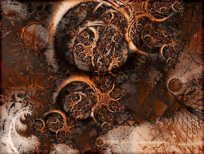
Merlin's Quest ( as generated, UF multiple layers)
The second one seems more exciting, more harmonious, more 'finished'.
 Merlin's Quest (contrast balanced, USM and resize)
But is there more I could be doing to bring out the beauty? What are your favorite techniques in postwork? Help me out here, folks!
~Viv
Tuesday, March 13, 2007
The Persistence of Sierpinski

The smaller you look, the larger you see.
There are two modes I apply when working with fractals or graphic software in general. One is to keep a close eye on what does what, and when I find a good combination of effects, write down the sequence like a script: scripting mode. In fact, in the graphics programs the GIMP, and probably Photoshop too, there are scripting capabilities that create new, composite filters from the combination of individual ones.

The other mode is to idly add effects and just click on things and see what happens: improvise mode. This tends to produce things that are usually unreproducible because you can't quite remember what you did and what you undid and what you did after the undid. Doing this for a while is a great way to collect experience that will later allow you to build "scripts". I often move into improvise mode after a lot of careful scripting goes nowhere.

And then I often go into scripting mode after a lot of senseless and semi-random clicking produces a nice effect and I really wish I could do it again. Sometimes you just get lost, and like the location of some buried treasure you may have found during a storm, you're unable to find your way back. I think I said once, that some filters make mountains and some filters make dust. Hasn't everyone who works in the digital medium made an image and in the process of perfecting it, lost the whole thing, just like the proverbial fish that got away?
Maybe I should stop using a graphics program that only has one level of undo.
Tim Hodkinson
Technorati Tags:
fractal art, fractal, sierpinski, digital art, creative process
Friday, March 09, 2007
Different Strokes For Different Folks
So you want to use fractal design in a different way? Try a fractal art quilt:
 This piece is created from cotton fabrics hand stitched, embroidered and quilted.
I am curious as to what your reaction is to this art form.
See more fractal art quilts here - Rose Rushbrooke
What other ways are you using fractal designs? Post some images and descriptions please.
Monday, March 05, 2007
Mysteries of Faith and Art
Why did the fractal cross the road?
To travel back in time?
Compare this image:
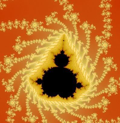
The familiar Mandelbrot Set form.
With this image:

An Ottoman illustration of the sacrifice of Ismael (1583).
The resemblance should not be a surprise. We've all seen fractal forms embedded in nature -- trees, river currents, lightning, cauliflower, cacti. These forms are in us (as a nervous system) and right before our eyes every morning (the lines on our faces). That fractal forms, dating back to antiquity, show up in visionary and devotional iconography simply illustrates the maxim that art holds up a mirror to nature. Fractal patterns are often found in early African and Latvian art. Prototypes of the Sierpinski triangle appear in the 12th Century art of the Ravello Cathedral. The structure of Hindu temples is striking in its self-similarity. In fact, most spiritual diagrams, from the mandala to the yin-yang, have noticeable fractal characteristics.
And, speaking of the mysteries of faith and art, like it or not, more contemporary fractal yin-yangs occasionally pop up -- unmuted and unwelcome -- in our not-quite-religious and often less artistic tele-visual services: the pop communion of commercials:

A sacred, self-similar Swoosh?
~/~
--Terry
Rooms with a View
Blog with a View
Initial images seen at this interesting blog: Mathematical Paintings and Sculptures. Nike gloves seen on bikepedlar.
Technorati Tags: fractal, fractal art, devotional art, art history, mandelbrot
Sunday, March 04, 2007
Fractal UN
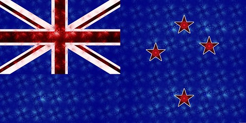
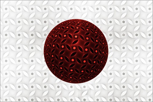
Am I the only one who likes to play "fast and loose" with other country's flags?? It started with the Israeli flag and has continued from there.
I present to you, in no particular order:
USA
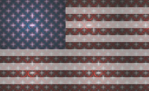
Ireland - Made for St Patrick's Day

The United Kingdom
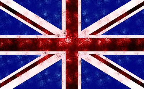
Korea

New Zealand - My Home :)
Japan
China

Israel

and finally, one of the flags that represents Maori (the native people of New Zealand).

No doubt, more flags will be created before I get bored with this.
