Monday, October 30, 2006

Fractal Trick or Treat?

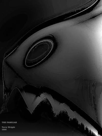
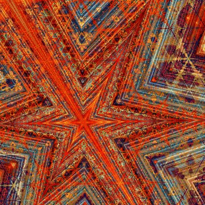
The Familiar

The Familiar (1999)

I've always been more interested in using fractals to push ideas rather than to serve as decorations

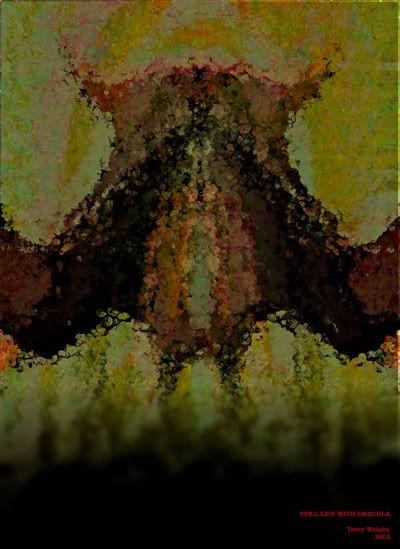
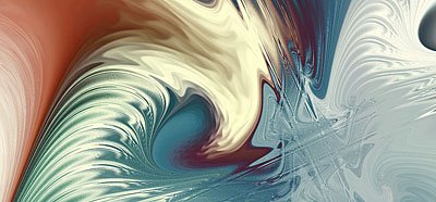
Still Life with Dracula

Still Life with Dracula (2002)

and this approach has sometimes proven very handy at Halloween to illustrate horror themes

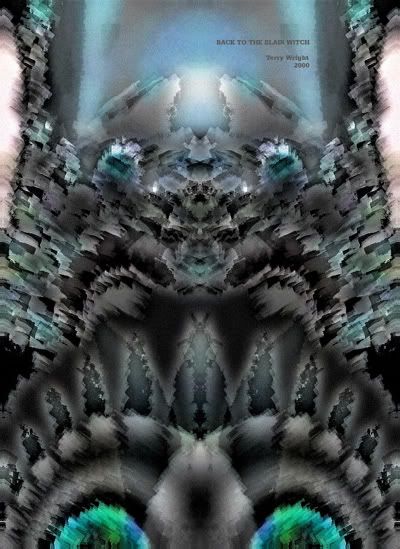
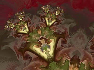
Back to the Blair Witch

Back to the Blair Witch (2000)

because although fractals can treat by assuming forms that are strikingly beautiful and infinitely lovely

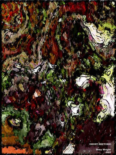
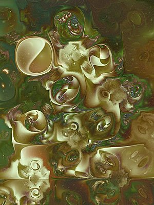
Ghost Rhetoric

Ghost Rhetoric (2003)

they also occasionally trick by mutating into forms that are awful and terrible and horrible and icky

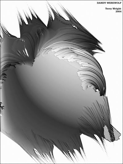
Dandy Werewolf

Dandy Werewolf (2004)

but, of course, and by an artistic process combining both treat and trick, only in a frightfully fun way.

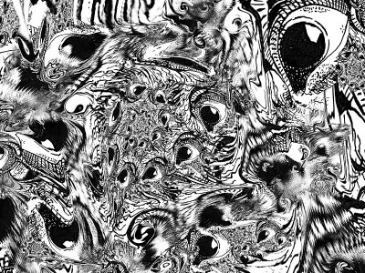
The Persistence of Vision

This is another example of the Popcorn algorithm doing what I love about it: adding depth and texture, and a surreal distortion all at once.

My mother was a little worried about me using other people's images in my Sprite work (I had to ask myself when my 72 year old mum - who is also an artist - started worrying about such things...but never mind...).

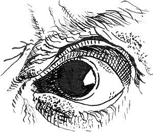
So lately I've been trying to exercise my limited and stagnating talents in "real world" media. Hence the decalcomanias on my blog, but I've also been trying to do a bit of drawing. The image above was created by running Sprite on this:


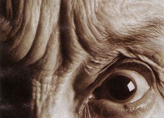
...wich was drawn from this:


...which appears in the latest issue of New Scientist. That eye made me think of Slavador Dalí - I don't know if it's his eye - which hinted at a title for the image.

Sunday, October 29, 2006

Do not expect a fractal ad

Just imagine the following situation between Justin Long and John Hodgman, the Mac and PC men (respectively) in the most recent Apple campaign against Microsoft.

Mac: Hello, I'm a Mac.
PC: And I'm a PC.

(The PC guy, dressed in his usual “boring” suit, is holding an LCD screen showing some odd pictures. Of course, everything else is pure white).

PC: Hum, hum. Good.
Mac: What are you looking at, PC? [asks Mac too intrigued since there shouldn't be anything interesting on the PC side of things].
PC: Oh, I'm looking at my most recent fractal creation. Do you want to see it?
Mac: Sure. [Mac, in his cool sneakers and angelic blue outfit, sees the picture, and then says with a broad smile] I can do fractal pictures too.
PC: Can you?
Mac: Sure, let me show you.

[Mac, always on the “right” side (from our viewers' perspective), makes a smooth move to the right side of the QuickTime player window, and from that edge enters a gorgeous and sexy looking lady from some exotic place bringing Mac a spectacular 30-inch flat panel. Mac takes a look at his screen, and with eyes as wide as the full moon decides it's time to show no emotion at all. Instead, he wispers to the exotic lady]

Mac: What is this?
Exotic lady: Tiz iz yore flak-tar pick-sore [her eyes sparkle with a synthetic flirting glance].

[Mac went pale and mute].

PC: Can I see it?

And just when Mac was ready to turn the flat monitor our way, QuickTime quits unexpectedly.


PCs excels in fractal art, no doubt about it. It is because there is no Mac software that can compete side by side with any of the most popular PC fractal generators. Of course, there are a few, but those that are good enough are shareware, and as such restrict what the tester can do with them, or the kind or size of picture that can be saved. I'm not even sure what their authors' terms are regarding the distribution or showing of pictures done with their unregistered software. In order to use them to their fullest potential, users must pay for a licence code. Yes, that's the norm, but the point is that while there are free options for the PC, Mac users have practically no other choice but to pay the price of being part of an advertisement-born elite. Things are changing now that Macs have dropped prices considerably and are targeting prospective new buyers (alas with the never changing “be welcome to the —same old— elite” motto). Would there be a change towards us, fractal zealots, as well?

If Mac programmers want to get the attention of fractal enthusiasts —and to bring them forever to the Mac OS side— they will need to create the right conditions, the right atmosphere for a growing, genuine, lasting interest in fractal art. I'm not an expert (that's for sure), but my guess is that it might/should work like this: first give the potential user something completely free and powerful enough (without giving away everything) to play with in order to generate the necessary demand for a commercial product. Otherwise, how would they be inclined to buy a fractal generator if they haven't developed the “psychological need” to get something better in the first place? How would programmers expect them to jump into the “Get me/Buy me” flow if they haven't felt the need or the urge to go beyond?

The freeware fractal generators for the Mac I have tried so far are somewhat superficial or too plain: they resemble those simple PC fractal generators of “old age”. Maybe it's because I haven't searched enough, but the only decent and truly free application among them is Mandelbrot on Cocoa. While it is fun to use, it lacks parameter controls and other algorithms found on PC programs such as Fractal Explorer, Tiera-Zon, or ChaosPro, to name just a few; those are so good that many people will keep working with them forever (just as I do). PC users looking for more will get Ultra Fractal, which right now is the top of the line, in a class of its own.


Macs have always been the standard for graphic designers, digital artists, and all other kinds of graphics intensive tasks. Fractal art fits perfectly in that domain, so why isn't the Mac fractal friendly? Why aren't Mac programmers interested in fractals? Is it easier to code for Windows? Is it because Mac hardware hasn't been accessible to the masses (even though Apple has always advertised its software as the easiest in the world)? Now that Apple is trying so hard to attract the public's attention, are we to expect more and better Mac fractal generators in the near future?

Thursday, October 26, 2006

Inside Julia Sets in areas of Strange Attraction

This is just a quick mention of the interesting results from viewing the inside of Julia Sets from areas of strange attraction.
It's particularly interesting when a conditional spherical inversion or reflection is applied to force a "normal" fractal formula to not diverge or at least diverge less often.

Here are two examples:

THE BATCAVE


EGGSHELL


Both are just views of the inside of Julia Sets from the standard Mandelbrot (z^2+c) simply modified by applying a circular inversion (The Batcave) or circular reflection (Eggshell) whenever z is outside the given circle of inversion/reflection.

One of the benefits of this method of creating fractal images is that you get very interesting results from very low maximum iteration counts - typically 10 to 30 - so render times are small.

The main formula that created the above was "Attractors" from mmf4.ufm which is in the Ultrafractal formula database. The formula also allows rendering of strange attractors and other interesting orbits with a dedicated colouring algorithm in mmf4.ucl.

Monday, October 23, 2006

"Better" than Pollock?


Back twenty years ago in high school English class I read or studied, or something, Julius Caesar by George Bernard Shaw.

Shaw, as he is called by those who are familiar with him, was something new for us high school students. We were quite familiar with Shakespeare as the school curriculum included one of his plays every year, like some sort of literary vitamin pill.

There are a lot of great literary things to be found in Shakespeare. Like dill pickles, it's an aquired taste, and five plays in five years wasn't enough for me. I came to view Shakespeare's lofty reputation as an exaggeration, the "official playright" of an imperial nation wanting to present themselves as the possessors of an old and well established, and uniquely English, culture of arts and letters.


The year before Shaw's Julius Caesar, we had been chained to our desks and deprived of the necessities of life until we finished reading, or pretending to read, Anthony and Cleopatra by that great playright, "the Bard."

In introducing Shaw's play, the teacher kept repeating (you have to do that a lot in high school English classes) how this play by Shaw presents some of the historical events found in Anthony and Cleopatra in a more historically accurate context.

Oh yes. I opened the book and saw the many scholarly primary sources that Shaw had exhaustively studied in order to begin writing his definitive play about Julius Caesar. It was shameless name dropping of classical historians. I didn't like this guy any more than Shakespeare.


Jumping to the back of the book, where the publishers add in all sorts of extra stuff, like commentary and analysis of the play by eminent authorities, I began to see the old bearded Shaw in shockingly different light.

"Better Than Shakespeare?" was the title of an essay about Shaw's play written by the Shaw himself! Wasn't it blasphemy to consider someone else greater than Shakespeare? And then to say it about yourself, that was even worse, assuming of course there was even space below such already depraved behaviour to sink even further.

All of a sudden I liked Shaw. He's Irish (the teacher repeated that a lot too) and apparently back then, maybe even now too, he was something of an outsider and not supposed to knock revered English writers off their marble pedestals.

To some of the English it was an embarrasment to have the historical absurdities of Shakespeare's Anthony and Cleopatra pointed out, and particulary by an Irishman. But then Shaw went one painful step further and corrected Shakespeare's mistakes by writing his own revised version of the events in his own play, Julius Caesar. Perhaps Shaw was thinking we could now throw Shakespeare's old play away and use his new and improved one in it's place?


I really didn't like Shaw's play much. Too "didactic" or teachy. You'd think it was intentionally written for a high school English class to study. But I liked his irreverent sense of humour. He should of stuck to making fun of the establishment instead of trying to become one of them.
 

Sunday, October 22, 2006

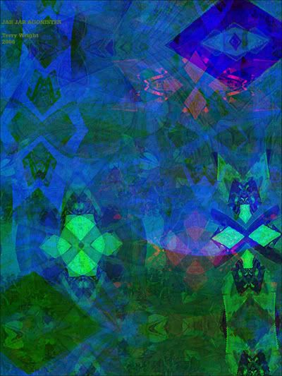
Jar Jar Agonistes

Jar Jar Agonistes

Jar Jar Agonistes (2006)

Gollum is way better.
I evoke birthday blight and snakes
to haul home. I stoke vitriol
and hollow men to guess the price

of my money pit. Sad to be
pitied more than Lieberman or
other juggling carpetbaggers. I seem
a nasty senator, a recycling

smattering of acting and idiot
clowning. Executable. Embedded
face down in a chemical treatment plant
to erase all screentime tribulation.

Decline the first glass coffin.
Meesa never asked to be born
or a racist Barney. I'm a rubber schema
and uncomfortable comic relief.

I must be expunged from all prints.
Even my death will annoy you.

~/~

This is a "Google poem" -- a found text compiled by bits of search phrase strings from Google searches of agonistes and jar jar.

Wikipedia explains the term:

The word Agonistes, found as an epithet following a person's name, means "the struggler" or "the combatant." It is most often an allusion to John Milton's 1671 verse tragedy Samson Agonistes, which recounts the end of Samson's life, when he is a blind captive of the Philistines (famous line: "Eyeless in Gaza at the mill with slaves"). The struggle that "Samson Agonistes" centers upon is the effort of Samson to renew his faith in God's support.

Probably the most famous post-Miltonic use of Agonistes is by T.S. Eliot, who titled one of his dramas Sweeney Agonistes, where Sweeney, who appeared in several of Eliot's poems, represents the materialistic and shallow modern man. Another well-known example is Garry Wills' 1969 political book Nixon Agonistes, discussing embattled president Richard Nixon.

Thursday, October 19, 2006

Rameses


One technique of the royalty is to claim connection to heavenly firmament. There was Louis XIV, the Sun King, and there's been a few sons of heaven, eg. the emporer of Japan. One evening I was watching a show on ancient Egypt, actually, the decyphering of the Rosetta stone. They were explaining how an egyptologist deduced the pronunciation of "Rameses". He'd concluded that meses was near enough to a known word meaning "born of". But the show jumped on from there, leaving me wondering, born of what? It would presumably have to be something to do with Ra. What's Ra?! Oh, Ra, the sun god, or just the sun. So Rameses would be, born of the sun. Unlike the rest of us riff raff. Well, well, well, the game was going on even way back then. Today it continues in the movie entertainment world, where we call them stars, not plain old actors.

The egyptologist Jean-Francois Champollion who figured out how to read many hieroglyphics from the copies given him in France, did eventually make a visit to Egypt. They say he ran around the walls reading everything with the eagerness of a kid let loose in a candy store. Maybe fractals are the same way, one big candy store.

Tuesday, October 17, 2006

Brush or brain ?

One often compare the fractal program to the "brush" of the painter. I don't agree. It's much more (at least for me).

Look at the image above... There is a lot of small details that would be difficult to paint (on a canvas or in photoshop, for instance). And even if one manage to paint them actually, one would be stuck at a fixed resolution, while the "parameter" encoding in UF and other fractal generators allow to render images virtually at any resolution. This is what is usually considered as the advantages of fractal programs as "brushes" over more traditional brushes. They allow to produce big images with arbitrary precision.

But in fact there is much more than a "brush"... Look again at the image above... I didn't have the slightest idea about what would come out as finished image when I started. (Actually I even often start from a previous image and mutate it.) I could never have imagined this complicated pattern, nor could I have planned such a complex mix of colors. So the program is not just a convenient tool to render images, like a brush is a convenient tool to put paint on a canvas, it has a crucial role to play in the creation process. Speaking just for me to avoid hurting people, I'd even say that it's at the heart of the creation process, providing me with patterns and shapes that I try to combine in a tasteful way. And I've a whole folder of images with great patterns, that (probably because of insufficient artistic abilities) I was unable to cook properly. I think cooking is a good analogy, indeed.

Of course, one may say that these patterns do not come from nothing, someone wrote the code behind them. As in this case this someone was me, I can tell you what I had in mind when I wrote it. The image uses a big coloring, but only a small fraction of the code is actually used. This fraction corresponds to what is needed to draw a regular tiling with equilateral triangles, to superimpose such tilings of different sizes, and tweak them a bit (in some top secret way, of course). So more or less, here is what I had in mind when I wrote the code :

A little bit dull, isn't it ? With this plus some very basic operations, repeated a few times, combined by the computation power of a computer, you get this pattern on the final image. The computer somehow magnifies artistic intuition. It starts from a very stupid pattern and it turns it into something complex, unexpected, unpredictable.

So I can sum up the creative process in a caricatural way :
- Very simple and stupid pattern idea from me (and when I say "from me"... anybody could have thought to this...).
- Incredible complexification by the computer to produce something interesting and new (let me emphasize this "new"... it can produce patterns and shapes no one ever imagined, just because they are too complex or irregular).
- Cooking of the patterns and shapes by the artist. This step can fail easily...
- Rendering with arbitrary precision and details by the computer.

So really it's more than a brush... it's most of the artist's brain. :-D

(Ok, after I wrote all this, I uploaded my image... and noticed that all these "details" and "patterns" weren't so apparent at such a low resolution... so you'll have to believe me.)

Sunday, October 15, 2006

The Robot's Renaissance


Although most labels in the art world have a number of interpretations, I define algorithmic art as artwork made with algorithms. An algorithm is a series of instructions.

Usually these instructions are computer commands and algorithmic art is made with computers. But it's the "mechanical" component that makes algorithmic art special and the machine doesn't necesarily have to be a computer.


Fractal art is a type of algorithimic art. The algorithms are primarily the fractal formulas but also the other programming components which contribute to appearance of the generated image.

Although purists would say true algorithmic art has no human modifications to it or any other human contibution (except creating the algorithm or operating the machine, of course), such a strict approach rarely works.


A small amount of human guidance yields enormous profits in the creation of algorithmic art. In fractal art this guidance comes in the form of adjusting coloring effects or choosing what part of the image to display, or adding layers, or any other arbitrary decisions that interrupt or alter the process of image generation.

Although randomly chosen parameter settings could theoretically reproduce all the adjustments made by a skilled fractal artist, I have never seen any examples of such mechanically made fractal art (ie. having a skilled appearance).


So algorithmic art (if you accept my non-purist definition) is primarily a collaboration between artists and machines. The more decisions the artist makes, the less mechanical the artwork is. The less involved the artist is with the process, then the more mechanical it is.

The machine becomes just another tool when complex layering and coloring are involved, similar to a brush in the hand of a painter... Digital brush, Digital canvas --Digital da Vinci.

But when the machine is elevated to the lofty status of "Giver of Art", "Oh, Silicon One"... It's every graphic utterance received with rejoicing and exultation... The artist reduced to a selfless slave, a lever pulling worm toiling in the shadow of The Great Mechanical Meta-Marvelous Master of Algorithmic Awe-Wonder...

Well, that's different.


I need to clean out my browser bookmarks. I accidently clicked on some old thing anonymously titled Main Menu, Algorithmic Art.

Richard Nixon once said that the reason people go to hear politicians speak is not to find out what they're going to do if they get elected, but to find out, "What makes this guy tick?" We're all curious about people and why they do what they do.

Honestly, I could never figure out what this guy saw in his own work. Why the excitement?

He's got a pen or marker attached to a drafting plotter that draws the results of some algorithm. It's nowhere near as interesting as even a simple mandelbrot formula would be. Has he never heard of fractals?


This second visit to his website, after a space of about a year, left me with a different impression. I think I know what makes this guy tick, now.

Look at the presentation of his, uh, simple images: Artwork framed alongside -and giving equal space to- the binary code of the algorithm that made them. The 0's and 1's starting and ending with a short strip of gold leaf!


I was touched by his reverence for the machine and I felt ashamed of the insulting things I had once thought about his work.

He's not ashamed of the mechanical roots of his artwork. In fact, he seems to see it as something to be admired, as if binary code could almost be beautiful all on it's own. Just like some architects who allow a building's stuctural components, like iron girders and concrete pillars, to be exposed as elements of style, having their own massive and mechanical, primitive charm.
 

Saturday, October 14, 2006

Automatic Landscape


Gouache on paper, scanned with hue shifts added in Photoshop.

Monday, October 09, 2006

There are no real things to be seen there...


I think the nature of modern art resides on its use of a given aesthetic to criticize the aesthetic itself. This is what makes modern art to be often seen as nothing more than pure “entertainment”. The ordinary impression is that most of art works are easily “done by everyone” or just “means nothing”, since there isn't any apparent compromise with “reality” or “nature” and, because of that, there aren't compromises with the old “good taste” for representing real things. Mostly, modern works of art are given the very impression that each form of art “determines” the effects to itself. Or its aim is to be unique to the nature of it´s medium. Saying like that emerges the concept that the unique area of competence of a given modern work of art coincides with all that is unique to the nature of its medium.

Contrary to illusionistic or realistic art, where the goal is to conceal art in favor of representation, modern art uses Art to call attention to Art. What once was only implicitly treated by the masters of “old” painting is now regarded as positive factors by contemporaneous painters: the surface of the canvas, the shape of the support (frame), the properties of the colors are now areas of interest for modern artists. Manet becomes the first modern painter due “only” to his interest on the surfaces where his paintings were painted. Moreover, he started with the destruction of the representation when he became the first painter to reject the visual illusion of dept which since the Renaissance was the most desired painterly object for artists. Meanwhile Cézanne sacrificed the correctness of a given image (human body, mountains, trivial objects) in favor of “fitting them better” into the shape of the canvas. So, from then on, the representation of the object is no longer important. Since then there aren't real things to be seen there, in the modern painting surfaces.

While the “old” painters supposed the aim of painting was to produce the most vivid illusion of three-dimensional space on a flat surface, the modern painters instead are rejecting such an illusion since they become aware of the flatness of the canvas. So, the representation of recognizable objects is no longer important. Moreover, recognizable objects can´t “live” in a space which isn't three-dimensional. Under such a condition the reality of the object disappears.

As for that “lack of reality”, almost the same thing can be said about modern fractal art. Since the space of fractals isn't a real space, how can we figure there real objects (rivers, trees, mountains, girls and bottles) if not by simple association? Or saying it another way: since all recognizable forms exist only in a three-dimensional space, the suggestion of a recognizable form only calls back to that kind of space. And I don´t believe continuing to “see real objects” in a three-dimensional space is the aim of the multi-dimensional fractal art. There is no reason for such a “literature”. To say it very directly - why start from a mathematical formula (or whatever it can be) to “see” a river at the end of the calculation? I think that fractals suffers from a “missing of reality” that becomes nearly unbearable for the artists. But the fact that fractals are created by nearly pure science means that their objects are not translatable into literary terms and must lose their tendency of “being real things” in order to became real Art. After the image importer, Sprite, however, Reality is invading fractals, but that is quite an another story.

Sunday, October 08, 2006

Retrospective (Part Two) - An Affair With Popcorn


I've gotten a lot of use out of Popcorn and derivative formulas. It seems very expressive, although one has to wonder whether simulated expression has any meaning. At first I just used it as a base on which to run various coloring algorithms, but after studying the work of Paul Carlson I had an idea: why not use Popcorn itself as an orbit trap?

Kafka's Bouquet (1999)
The next step had to wait until I understood Ultra Fractal transforms, and when I did, of course, I had to use Popcorn as the basis for one. The image below stirred up dim memories of looking through my mother's art books when I was young. I gave it its name without really consciously knowing what it referred to.

After the Rain (1999)
The rediscovery of Max Ernst and the fractal nature of much of his work (which I've talked about in a previous post) led me to emulate - but hopefully not simply imitate - his work. The addition of background skies to my "gnarlscapes" required the writing of complicated masking transforms which ran Julia sets with orbit traps distorted by Popcorn (jobs usually covered by the different formula types in Ultra Fractal)

The Song of Time (1999)
Eventually I felt I was just repeating myself and had to move on. Popcorn appeared again as another orbit trap, this time with fBm mapped on to the elements. Mapping textures on to the elements of orbit traps was something that I'd experimented way back in the original Popcorn Orbit Trap (which has a "Martin" coloring mode), but fBm was much more useful. Damien Jones supplied the fBm code (which was something of a tour de force of Ultra Fractal programming at the time)

Sunday Morning (2000)
Apophysis kept me occupied for a couple of years, and with that I was really just adding a GUI to things that other people had already done. Eventually I felt confident enough to add my own variation (although Scott Draves did "fix" it). I hadn't forgotten Popcorn.

Confusion (2004)
Sometimes I wonder if Popcorn has become a cliche (or perhaps, to put it in a better light, one of Kerry's "standards"). It can simulate expression, but what does that matter when it is the same expression over and over again? However, since it inspired much of my best work I don't think I'll ever be able to give it up entirely.

Journey (2006)

Fifteen Minutes


Fifteen Minutes

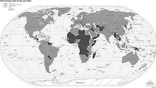
The map above is a representation of where visitors to my fractal site are from, as tracked by Extreme Tracking.com over the past five years. Light gray shaded countries denote countries that have had at least one visitor logged while the darker grays indicate those without hits. About 70,000 visitors have been recorded so far. Now, that’s not very many hits when one considers the daily traffic at Google or eBay, but...

When I think about it, it’s still pretty amazing that at least a few people in diverse locales like Mongolia, Peru, Kenya, and Albania have seen my fractal art and know my name. Without the Internet, this wouldn’t be possible.

This thought was reinforced when one of my fractal images was selected to be shown at the International Congress of Mathematicians in Madrid this past summer. People were actually waiting in line to get in and see the exhibited works. And I never even had to leave my home to create and submit the image – It was all done via the Web, the data sent over the wires and fibers and printed/framed thousands of miles away..

Our kids take the Web for granted. My teenage girls simply can’t imagine living life without it. Or without cell phones and ipods.. But for most of my life the Internet wasn’t around. Up through most of the Nineties, the odds of very many people beyond my personal friends and acquaintances knowing that I existed as an individual were virtually zero. So, the Internet has empowered my fifteen minutes of “fame”.

On the other hand, some things don't change. I spent today installing a new radiator in number one daughter’s car, with anti-freeze and transmission fluid dripping into my eyes and the usual resulting set of skinned knuckles. I did the same thing one Saturday back in ’77 with my ’68 Buick..

\\ How 'bout those Detroit Tigers?
\\\ Eliminated the mighty Yankees today..


-Paul

Saturday, October 07, 2006

Inky Blue


A simple fractal image - my first new one in quite a few weeks - something inky and blue created using 4 layers in Ultra Fractal. Perhaps my inability to paint and draw in the conventional manner leads to me to sub-consciously seek out the creation of fractals which look like they've been painted or drawn in some way. In this image I like the inky, "painted" look combined with the fact that this would be nigh on impossible to draw conventionally.

I'd like to add an apology for not having contributed to the blog for a while - I don't know where all the time goes to! Tina

Thursday, October 05, 2006

Oppression


My outlook isn't often negative. In this fractal, I interpret the spiral as a person tied down with weights. The blue pane to the top right is like a window to a better world for the poor spiral. Hints of green suggest the denied outdoors. The clinical techno feel suggests a clean, scientific kind of imprisonment. To me anyway. Maybe I should leave this kind of art to Guido ;-)

Wednesday, October 04, 2006

Raskh

Raskh © 2006 Janet Parke
Based on an original image by Gilles Nadeau.


Recently, Gilles Nadeau invited me to play around with an image he created in 2004. For several reasons, I rarely tweak others' images. In most cases, I find it's almost impossible for me to alter someone else's work without imposing my style upon it.
I can always make changes, of course, but I would not presume that they are improvements over the original artist's vision for his work. But in this case, I believe that is what Gilles desired when he sent me the parameters – to see his image through my artistic eyes.

Gilles' original image was an 11-layer study of a tree. Rather than make drastic changes to his original layers (I only made small adjustments to the gradients of two layers, and changed just one layer's merge mode) or add additional elements to the image, my approach was to introduce nuance into the colors, textures, and tree structure through some extensive masking (eight additional mask layers). I also added three layers of discreet coloring, but in the end, one might say that my process was not so much adding to Gilles' image as it was taking subtle pieces away.

My version is definitely a derivative of Gilles' image, but he has graciously given me permission to post my version here and in my galleries.

Janet

Monday, October 02, 2006

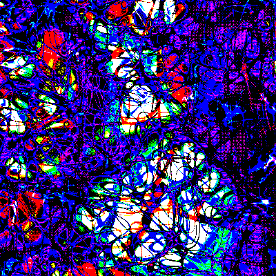
India Ink-194.8bf


Download parameter file "bug05.ink"


I've found a new toy.

It makes everything look like it was ripped out of an old book, so to speak.

Costs money. $15 US. Fully functional demo download.

Just like uscomic.8bf, it often takes uninteresting images and transforms them, lifting them to higher quanta.

People like me need all the help they can get.

I mostly use the Bayer pattern, but the bubbles can be pretty good too.

I use queen (or burn), softlight, or procedural+. Overlay has worked once or twice. Some of them seem to do the same thing.

I think you've got 2 weeks to buy it before it stops working, but maybe you can rip them off for longer.


Download parameter file "bug17.ink"


It's one of the cheapest filters made by Flaming Pear, but it's also their best. I tried out a bunch of the other more expensive ones, but I didn't find them useful. I don't think freaks like me are their target market.

I think it just adds a patterned layer and merges it with a preset method, but the Bayer method is a little more sophisticated. I'm just guessing.

One of the best rationalizations for not paying for shareware is: I'm not finished checking it out yet, I need another year. The next one is: I'm not a rich professional like they are, so I don't need to pay. Next: If they want people to buy it, then why are they giving it away for free? After that: Pretty soon I'm going to be so sick of using this thing I won't want it anymore, and why should I pay for something I don't want? Finally: Stealing is a victimless crime, like throwing a rock into a crowd.

When used with the GIMP it's really slow. Which is too bad since the GIMP has tear off menus which makes it a lot more convenient to access frequently used filters. XnView is much faster, but it's hard getting used to having only one level of undo.


Download parameter file "beetle05b.ink"


What does it do? It dithers the image using a variety of patterns. Not really, but that's the general effect. Dithering is much like a texture layer, but it can also re-draw the image, creating something that is categorically different.

Dithering or half-tone patterns can be very creative, altering the color and appearance of the image in intriguing ways. But not always.

Saving as a jpg makes for smooth gradients, but to keep the colors from changing (for the worse) you'll have to up the quality to the point the file size is ridiculously big. I save them as 256 color pngs, indexed in Irfanview which has a good dithering algorithm that preserves gradients adequately.

When something works out well, ask yourself why and try to reproduce those conditions. Digital skill is all about becoming part of the algorithm.


Download parameter file "crown09q.ink"


Filters are tools, they don't do anything on their own. That just about describes me too. Computers make everything so easy. That's why we've accomplished so much.

This filter really works well with the Inkblot Kaos fractal program. I only use the first "stalks" setting, but that one makes such awesome stuff I wouldn't have time for any others. The formula parser allows you to dream up enough creative variations to keep you busy for ages.

I think of the two programs as a team: Inkblot is the pottery wheel which forms the clay, India Ink is the kiln that fires it and adds the glaze.